The original figures from the book are released here under the Creative Commons Attribution 4.0 International License (CC BY 4.0). When you use a figure for your own work, please, cite the book appropriately, for example, like this: Christian Tominski and Heidrun Schumann. "Interactive Visual Data Analysis". AK Peters Visualization Series, CRC Press, 2020.
Some figures were created by colleagues from the visualization community and are used in the book under the CC BY 4.0 license. Below, these figures are clearly marked by giving the original figure author in the figure caption. When you use these figures, please, do include an appropriate attribution to the original author.
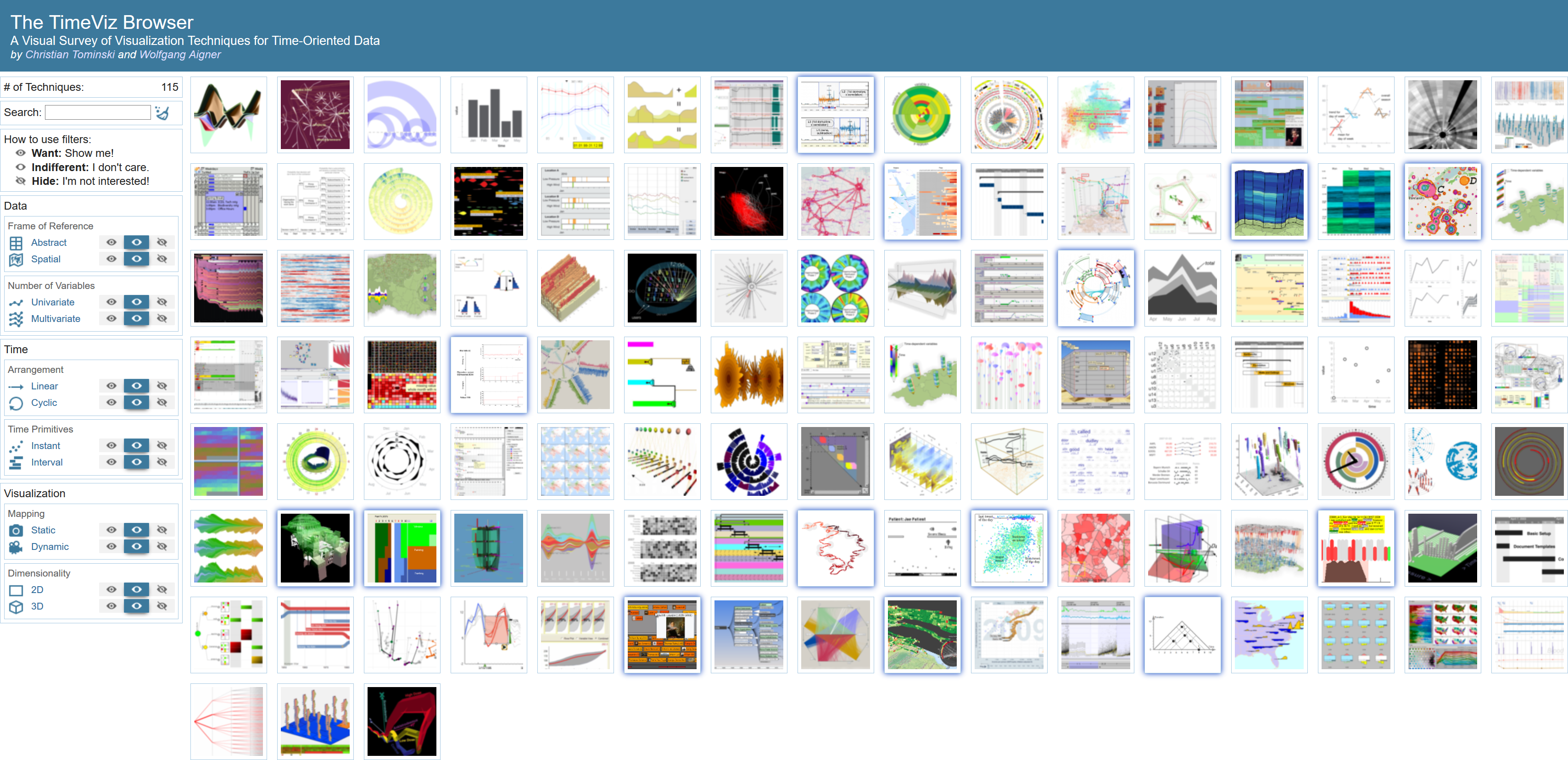
📦 Figure Download
You can download an archive with all figures from the book.
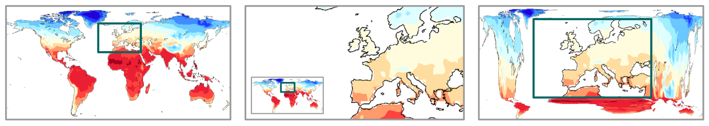
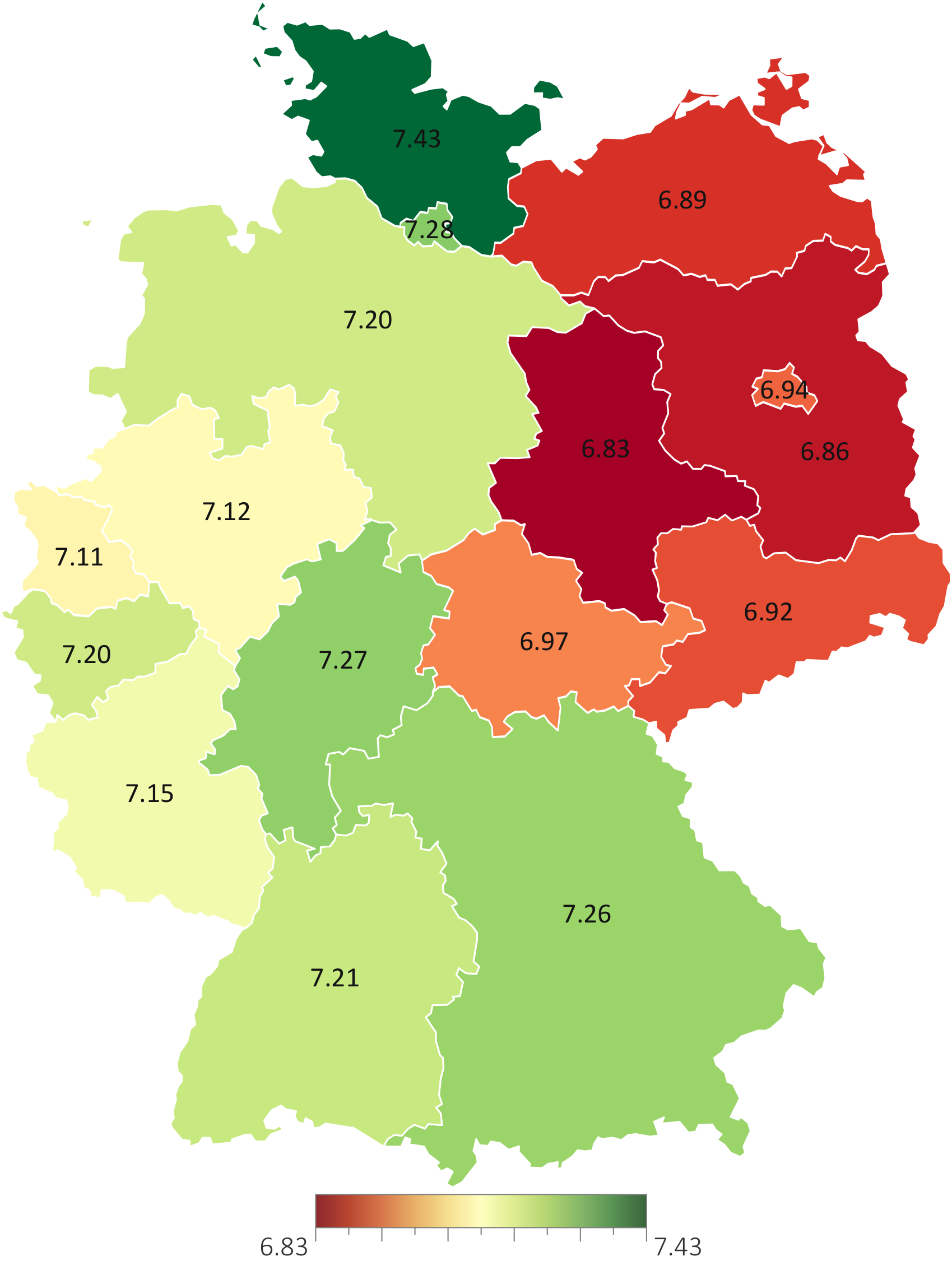
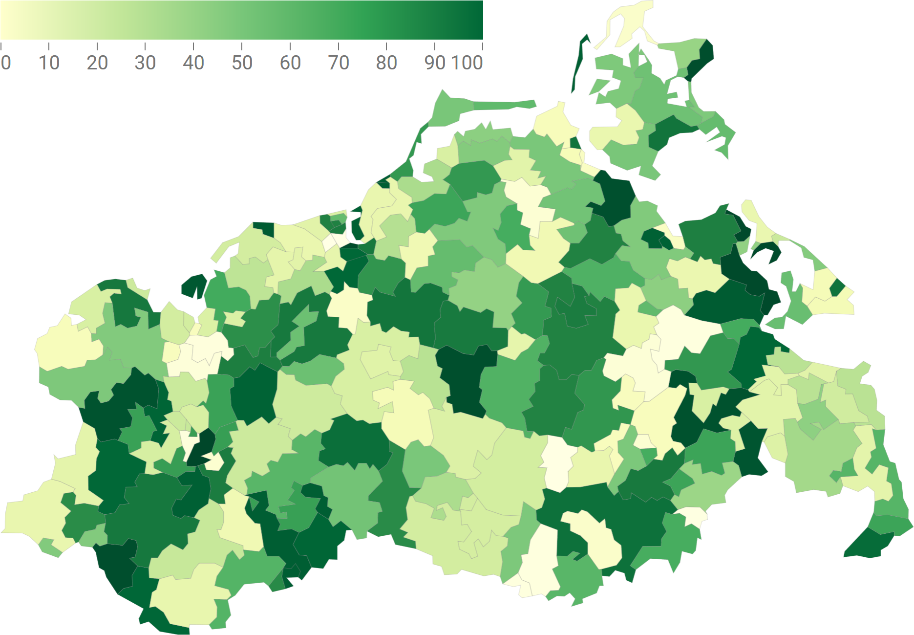
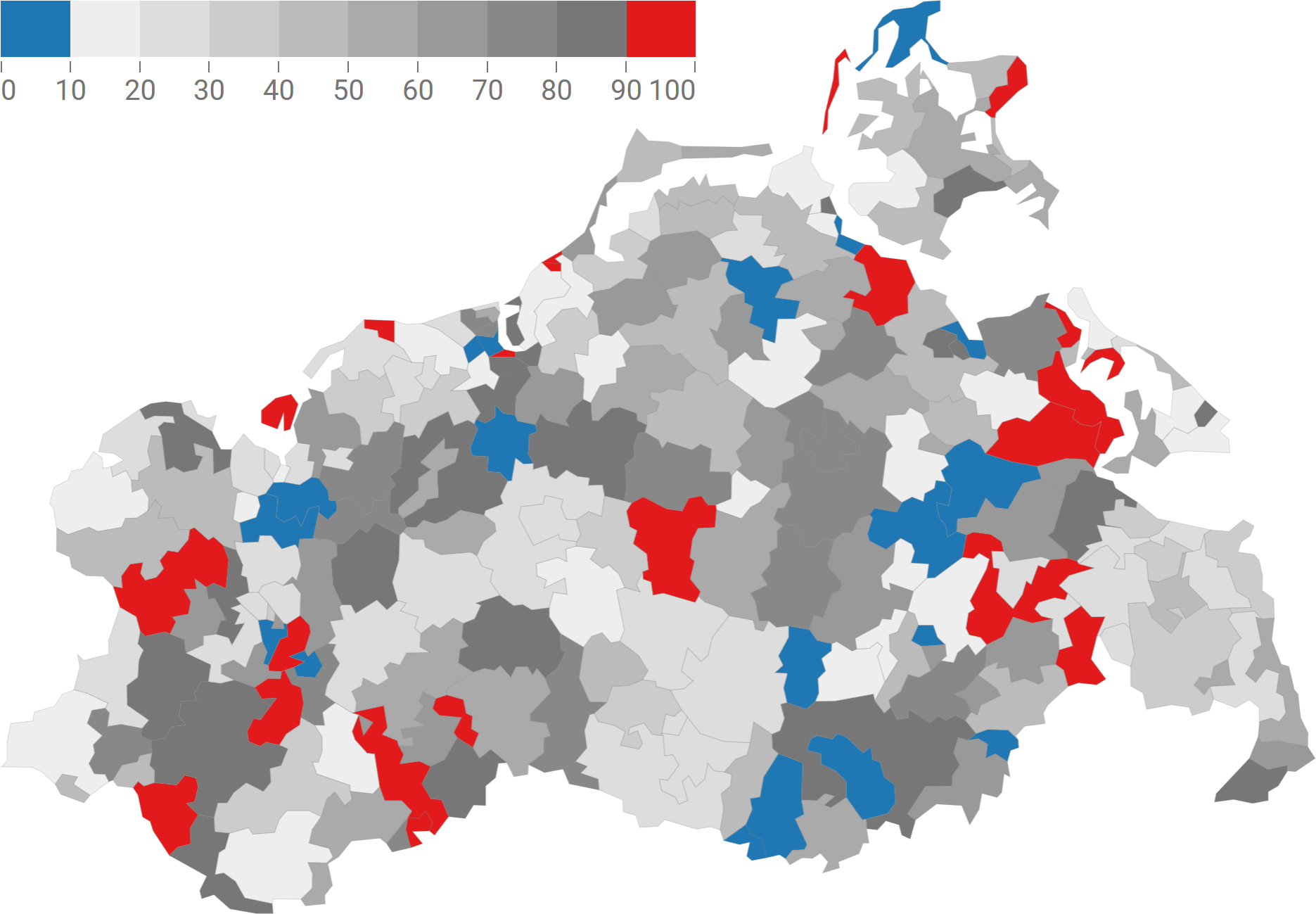
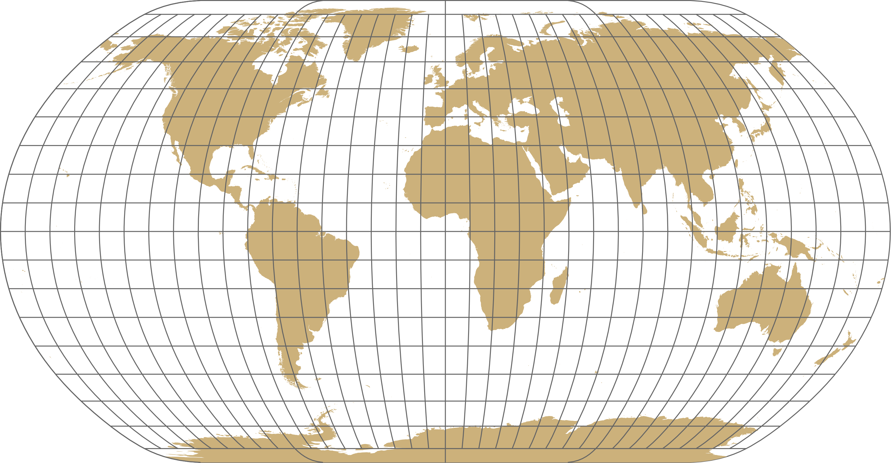
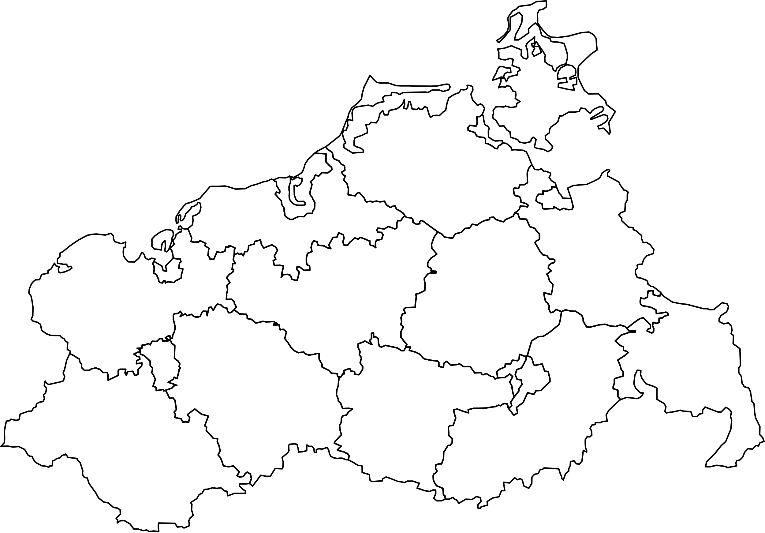
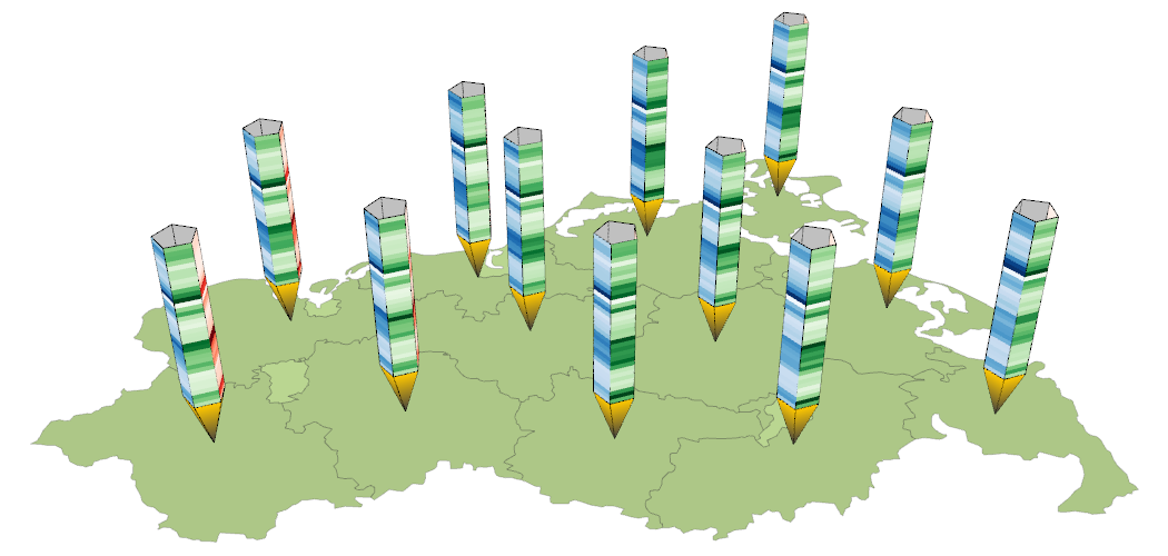
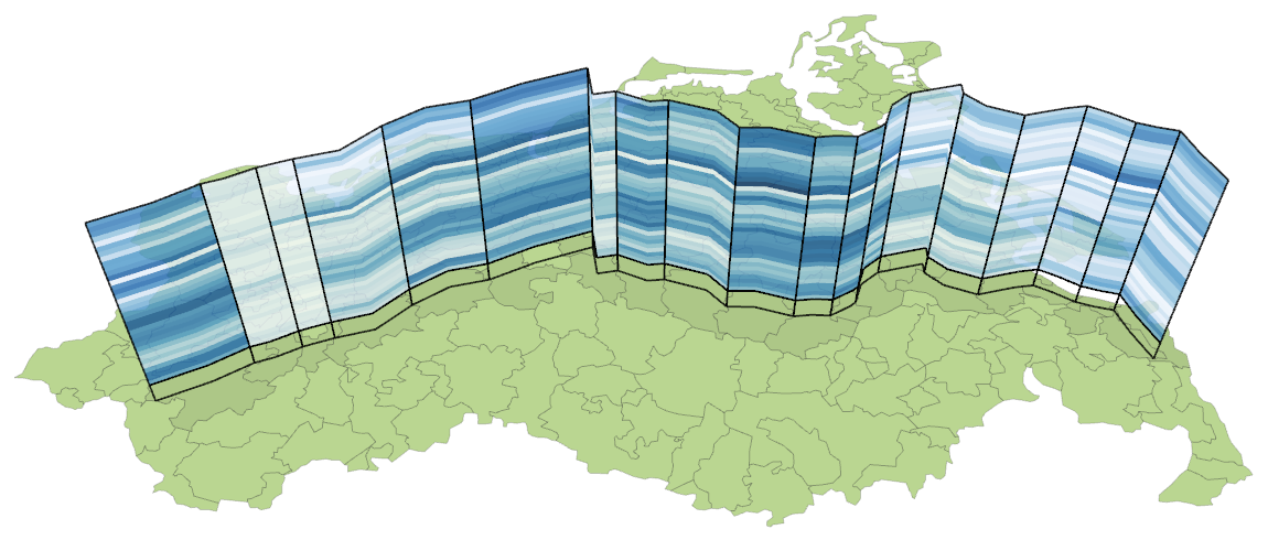
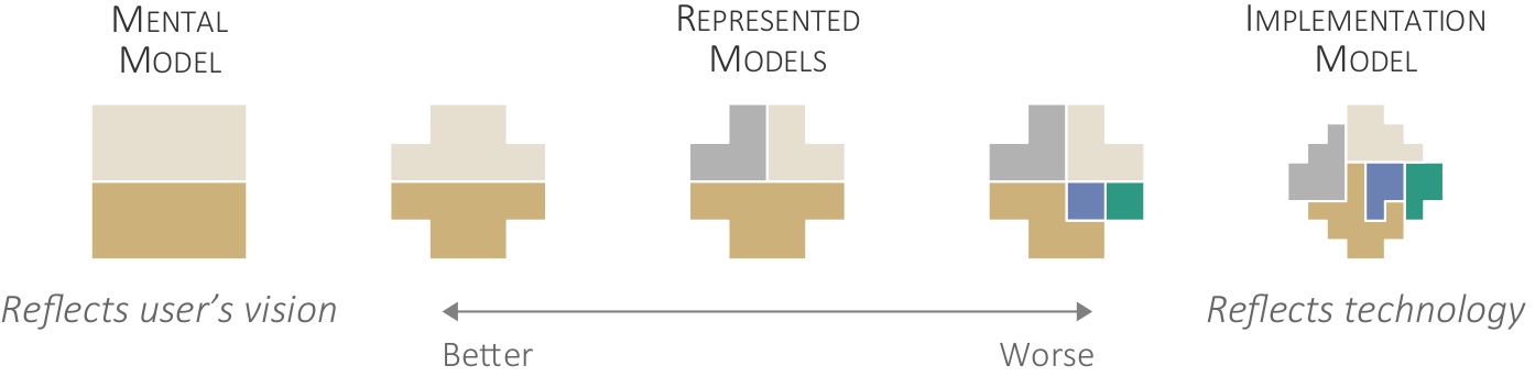
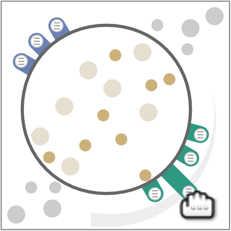
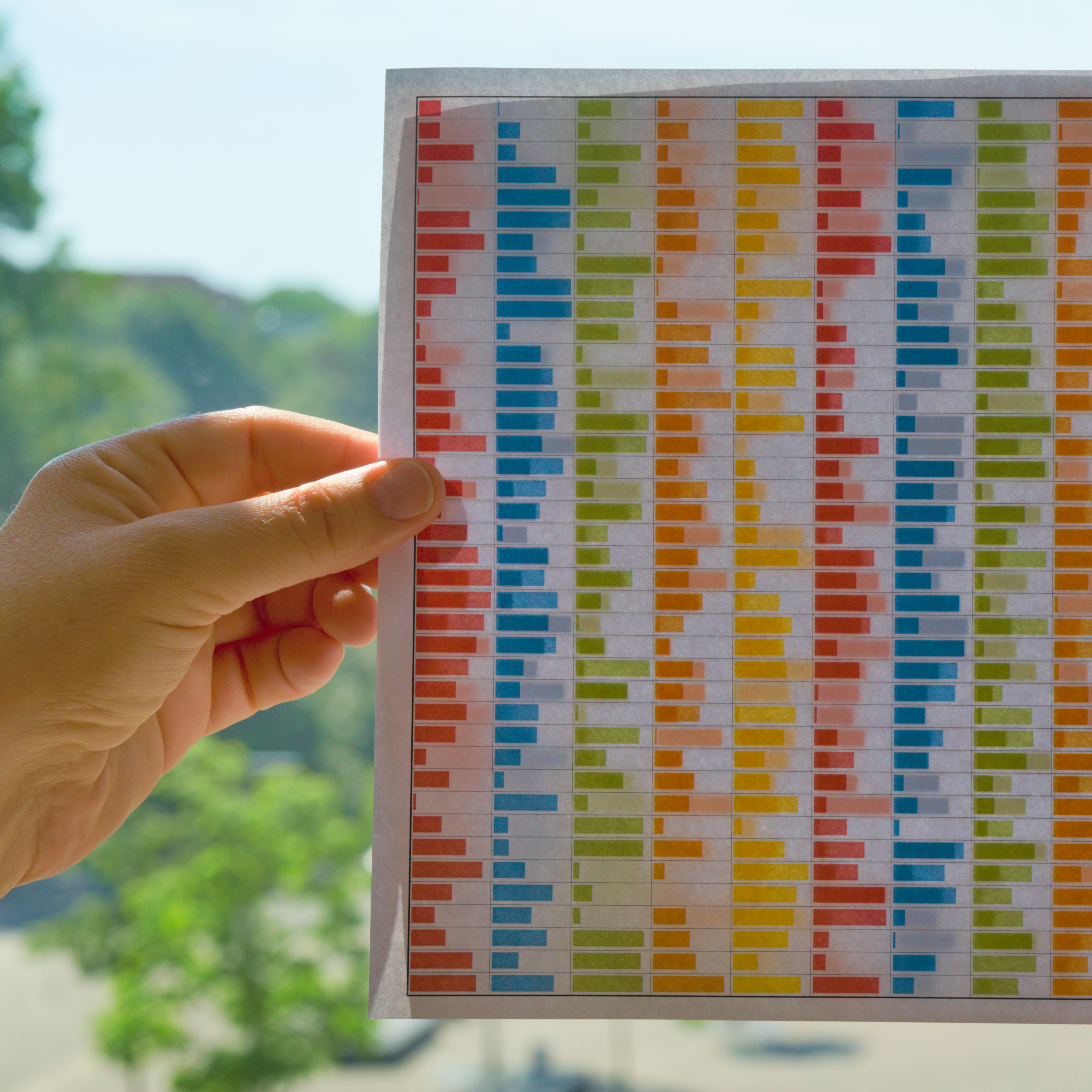
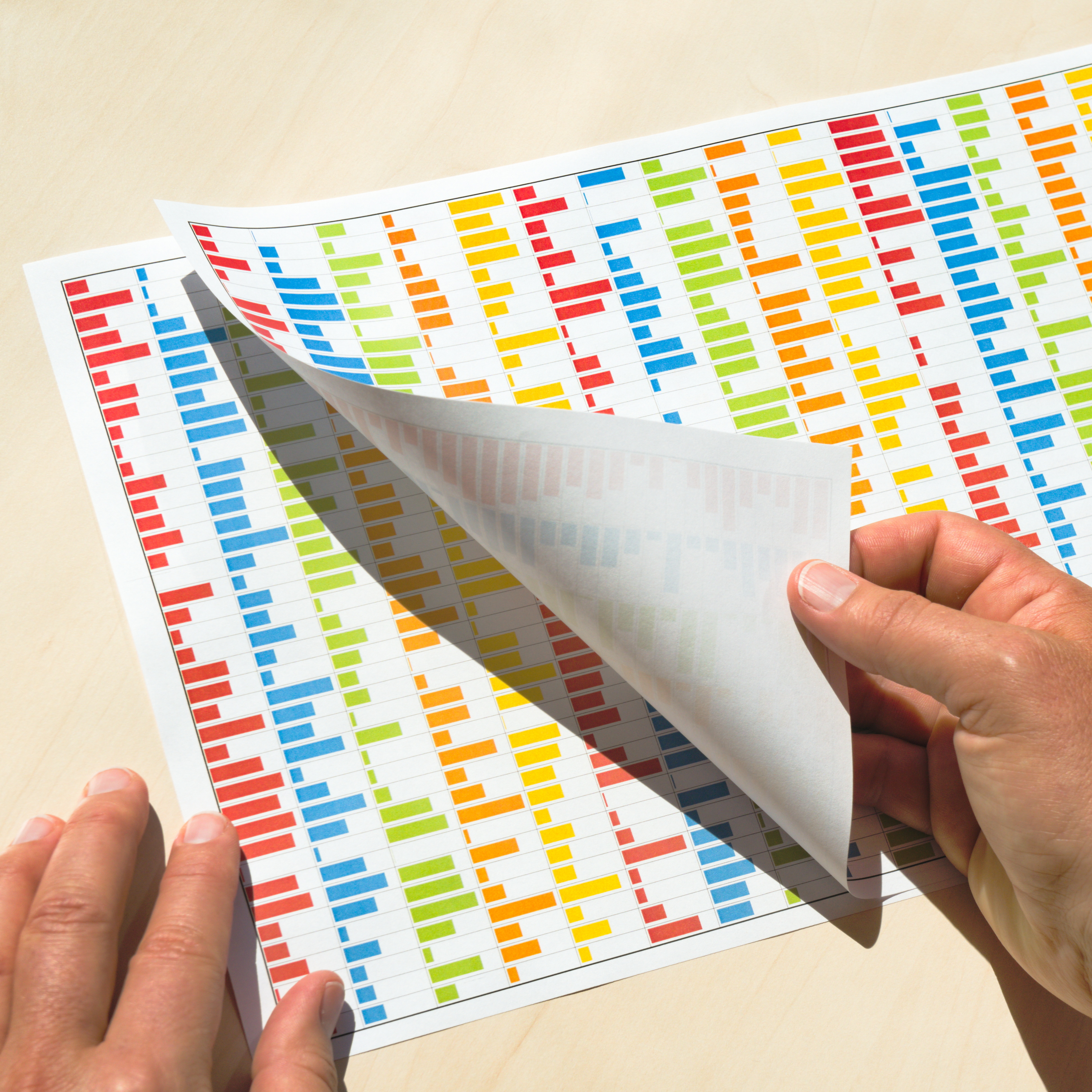
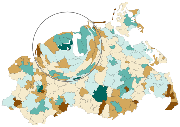
Visualization of life satisfaction in Germany. (a) Failing visual representation.
Figure
Original book figure.
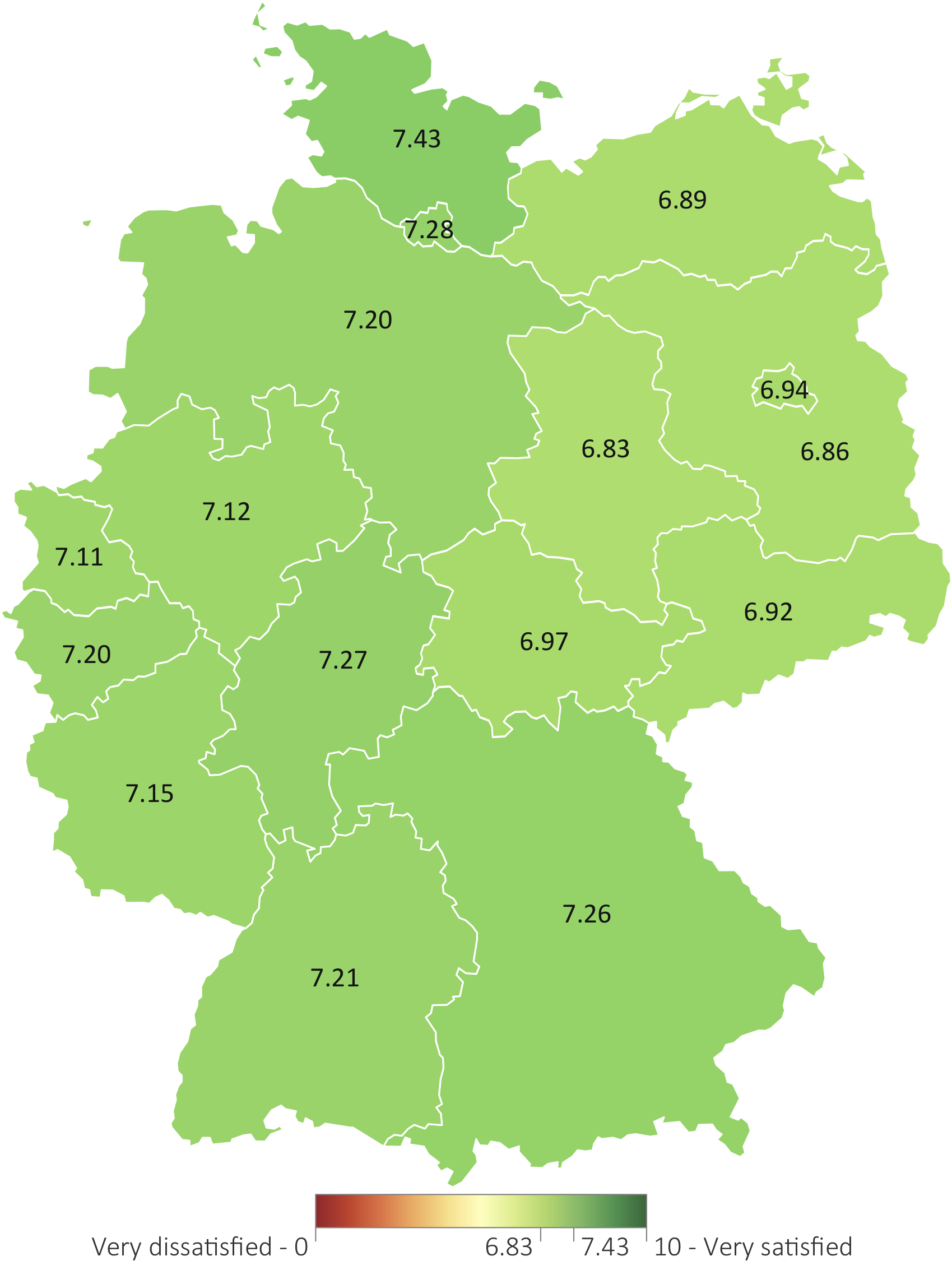
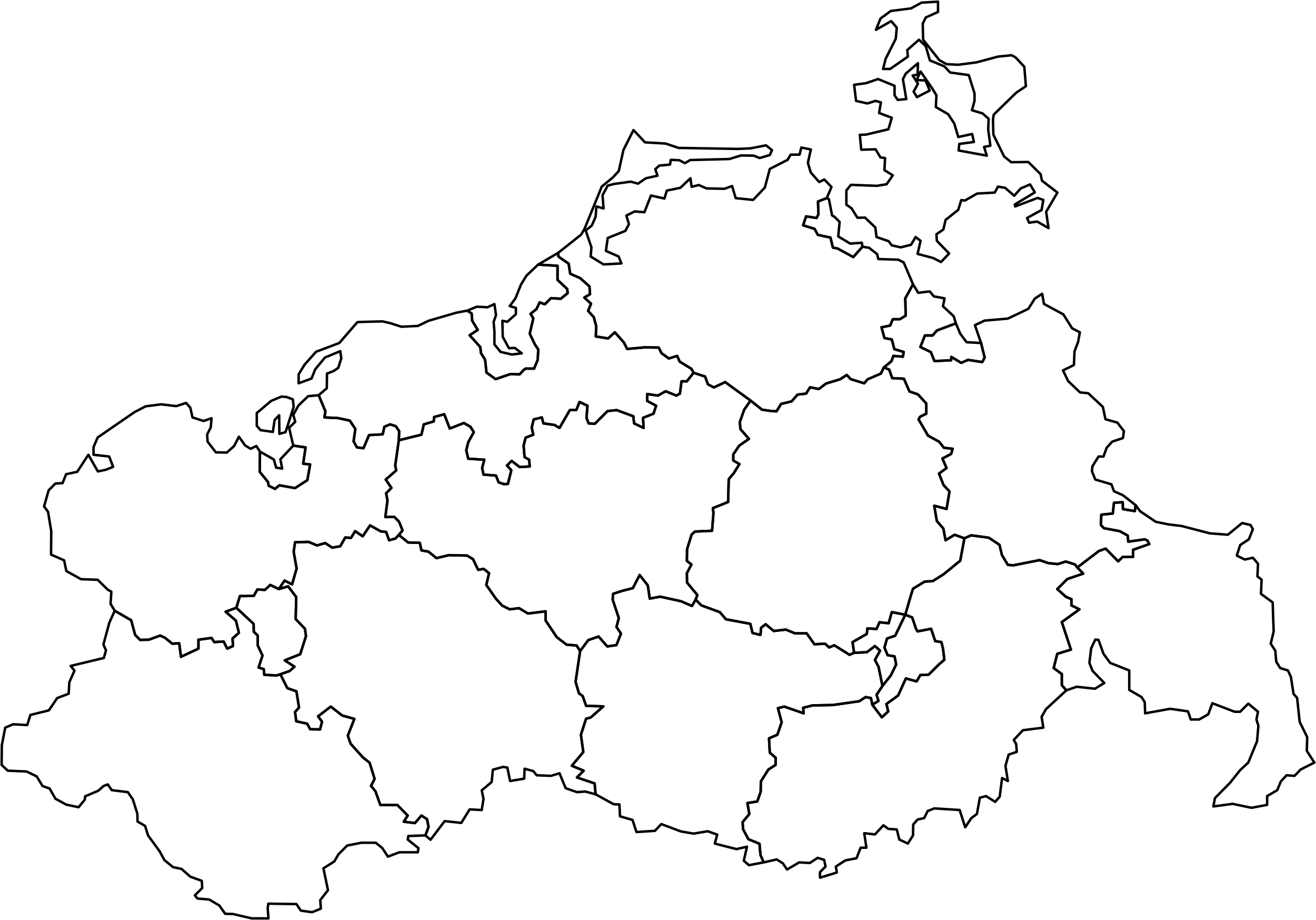
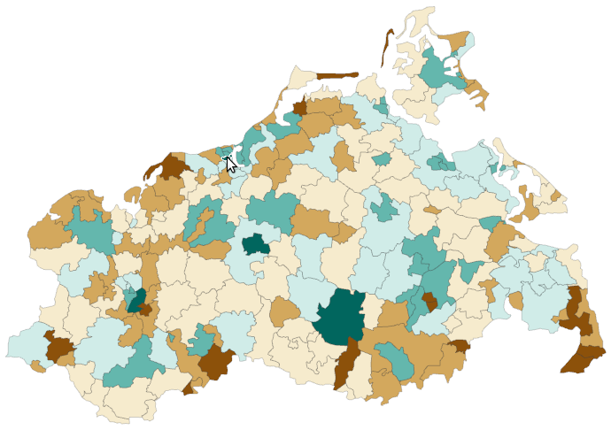
Visualization of life satisfaction in Germany. (b) Succeeding visual representation.
Figure
Original book figure.
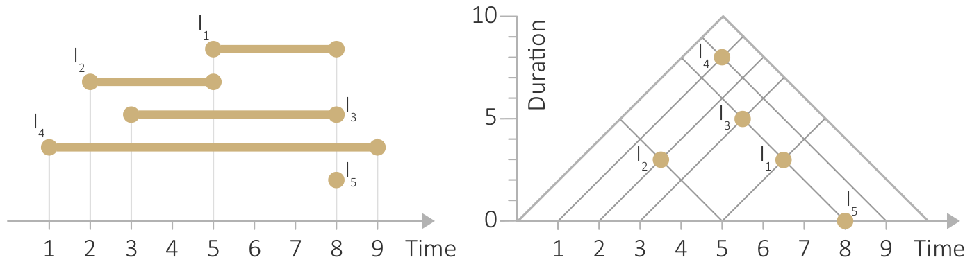
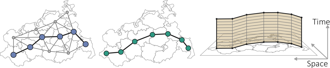
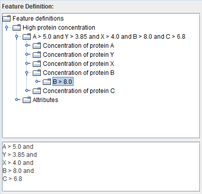
Functional dependency between the reference space and the attribute space. For a point in the reference space, there is exactly one point in the attribute space.
Figure
Original book figure.
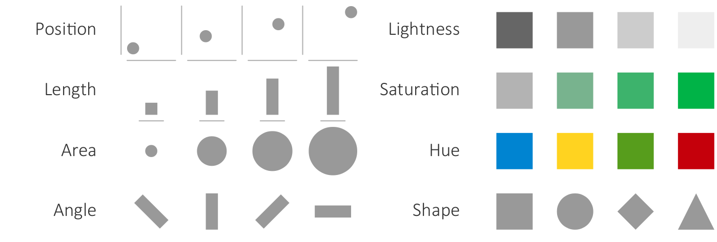
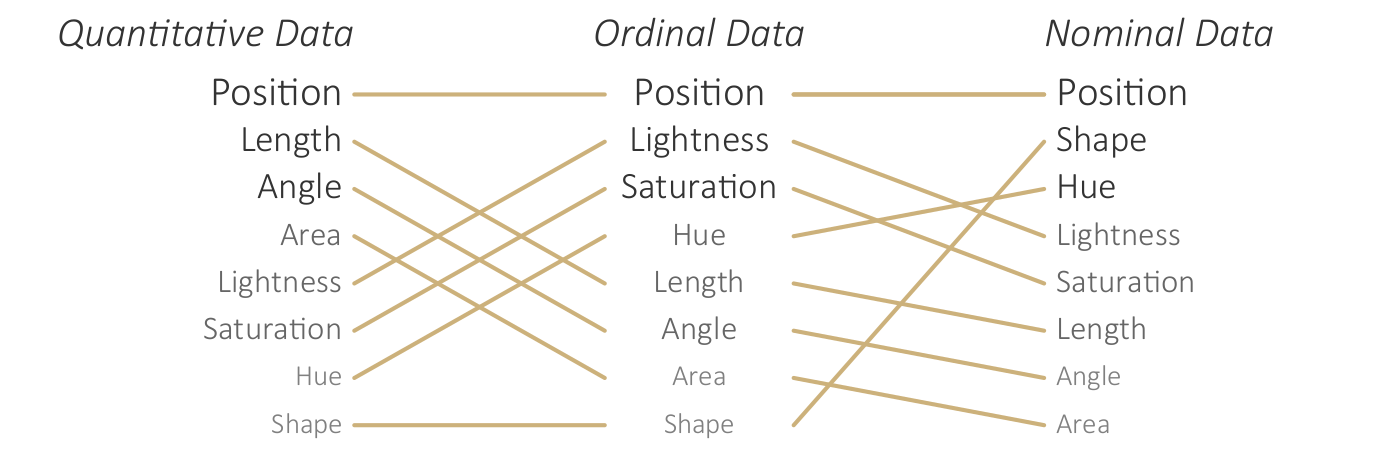
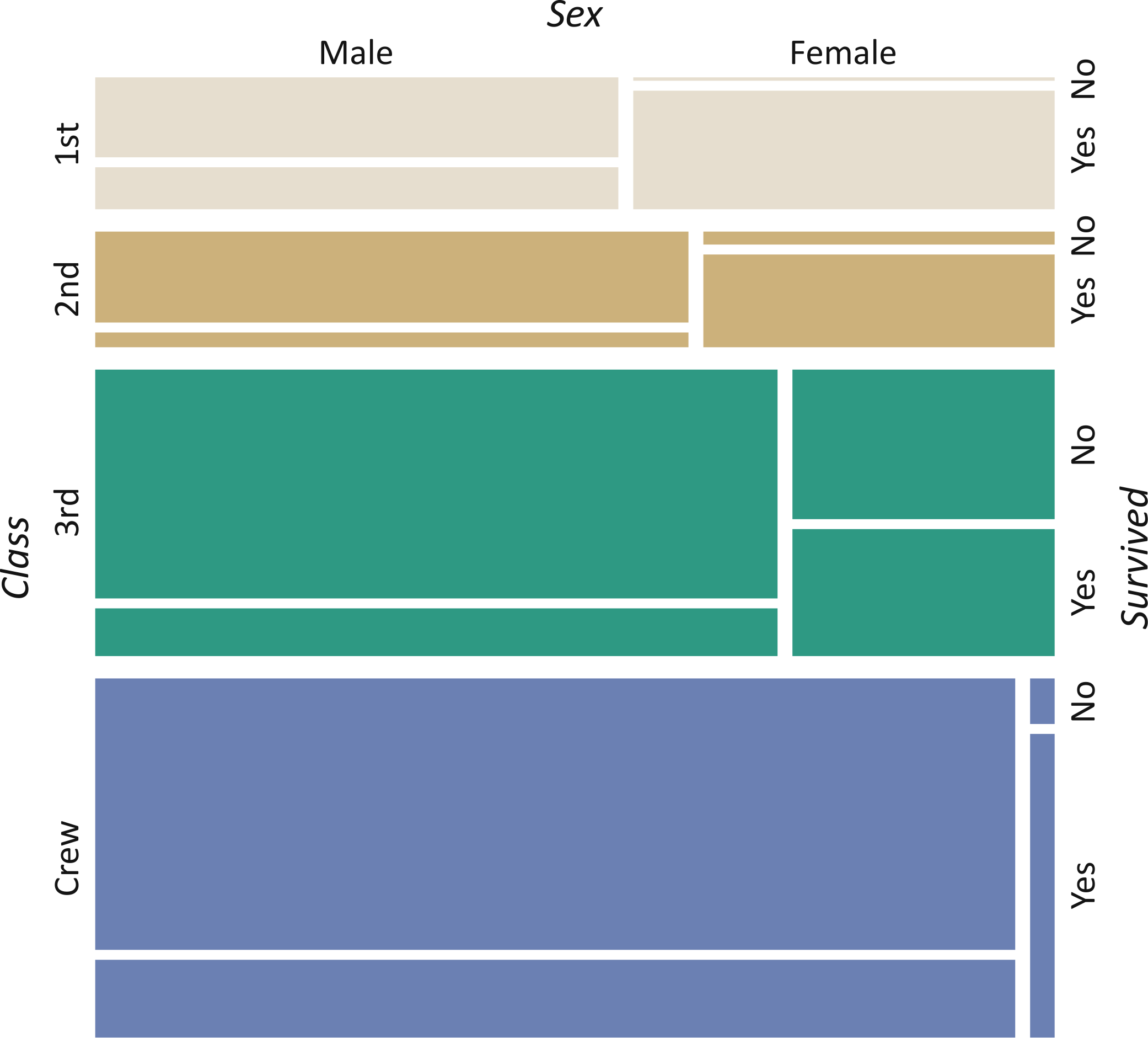
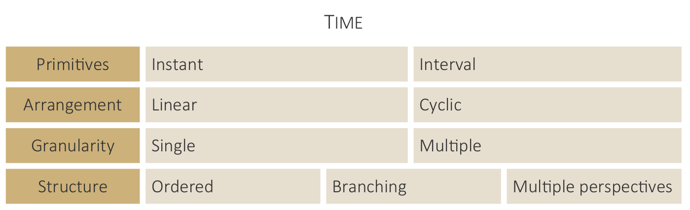
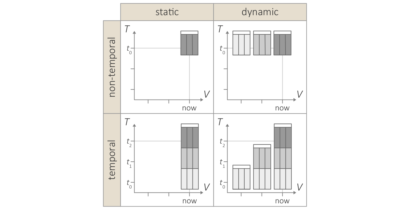
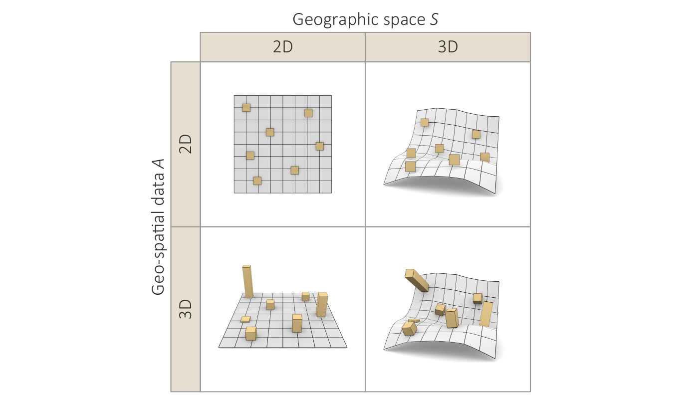
Key terms for characterizing data.
Figure
Original book figure.
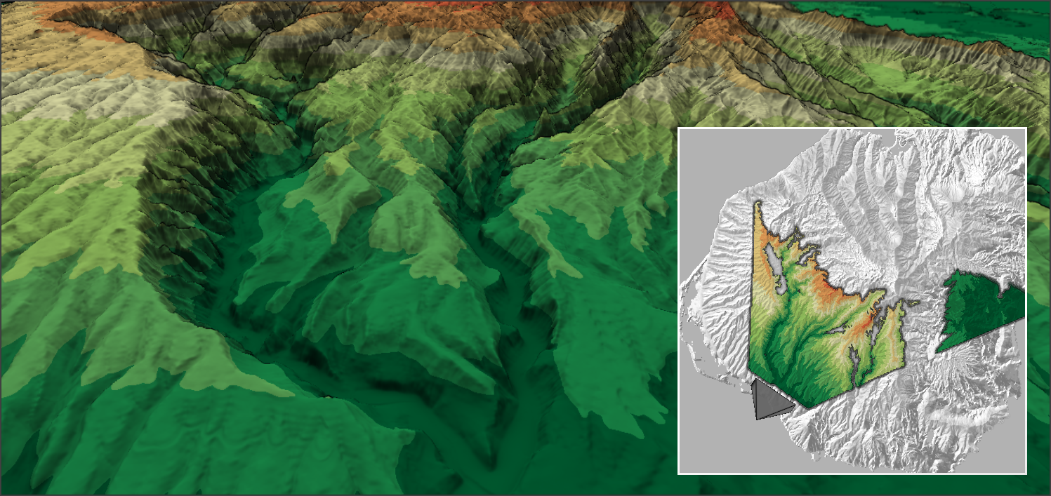
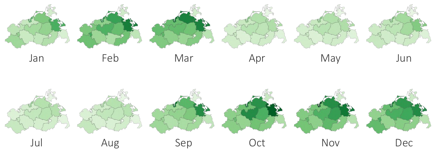
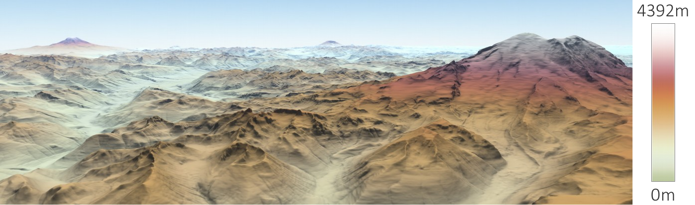
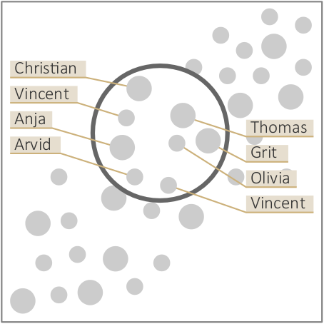
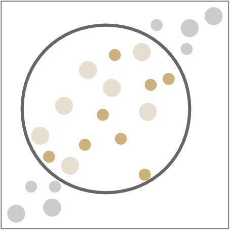
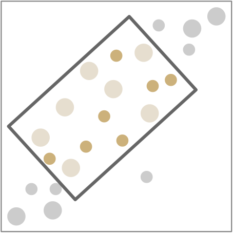
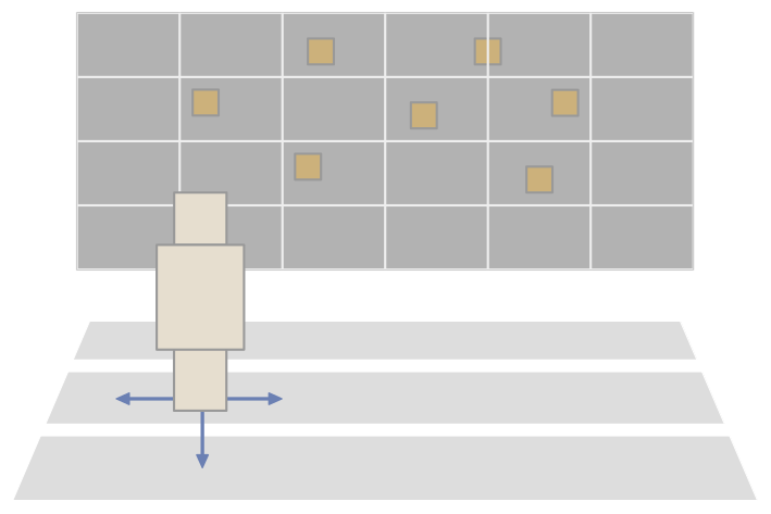
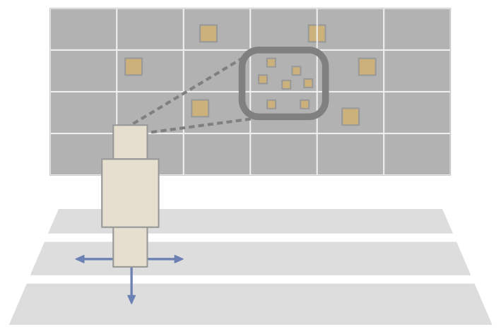
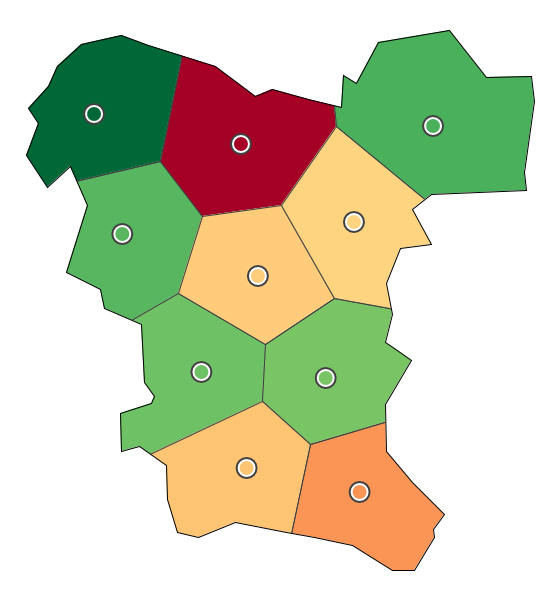
The scope defines to which extent an observation is valid. (a) Global scope. (b) Local scope. (c) Point scope.
Figure
Original book figure.
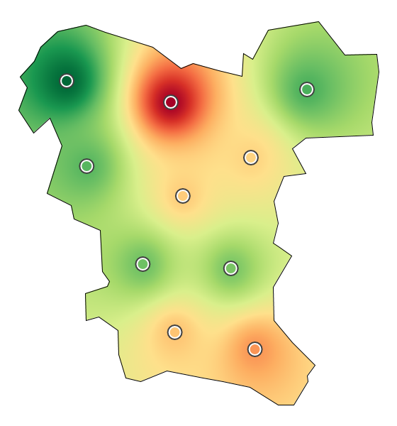
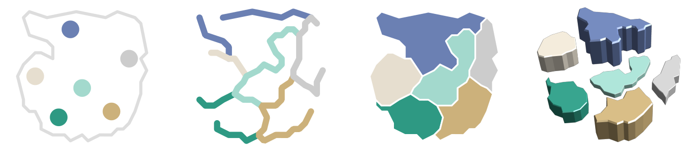
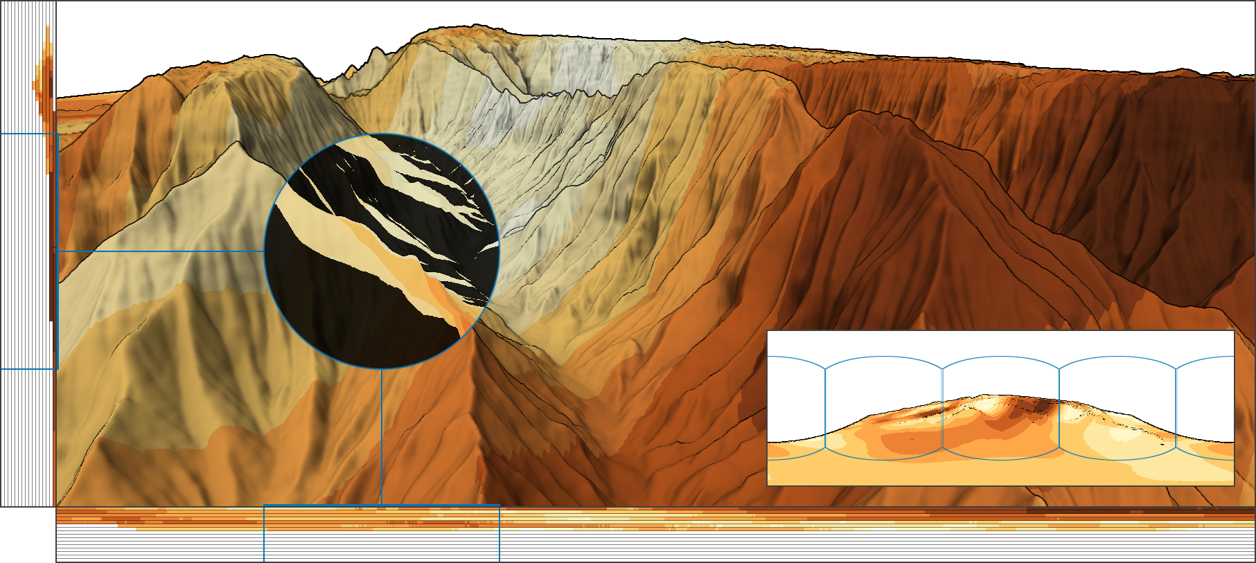
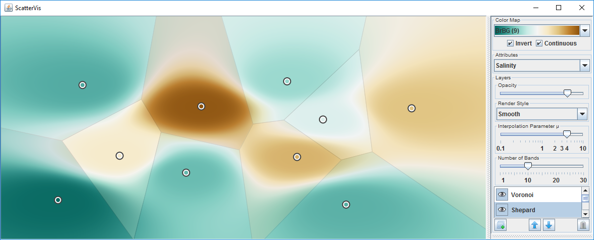
Visualizing the local scope of measurements of water quality. (a) Data points only.
Figure
Original book figure.
Visualizing the local scope of measurements of water quality. (b) Voronoi partitioning.
Figure
Original book figure.
Visualizing the local scope of measurements of water quality. (c) Shepard interpolation.
Figure
Original book figure.
Meta-data to characterize the data to be analyzed.
Figure
Original book figure.
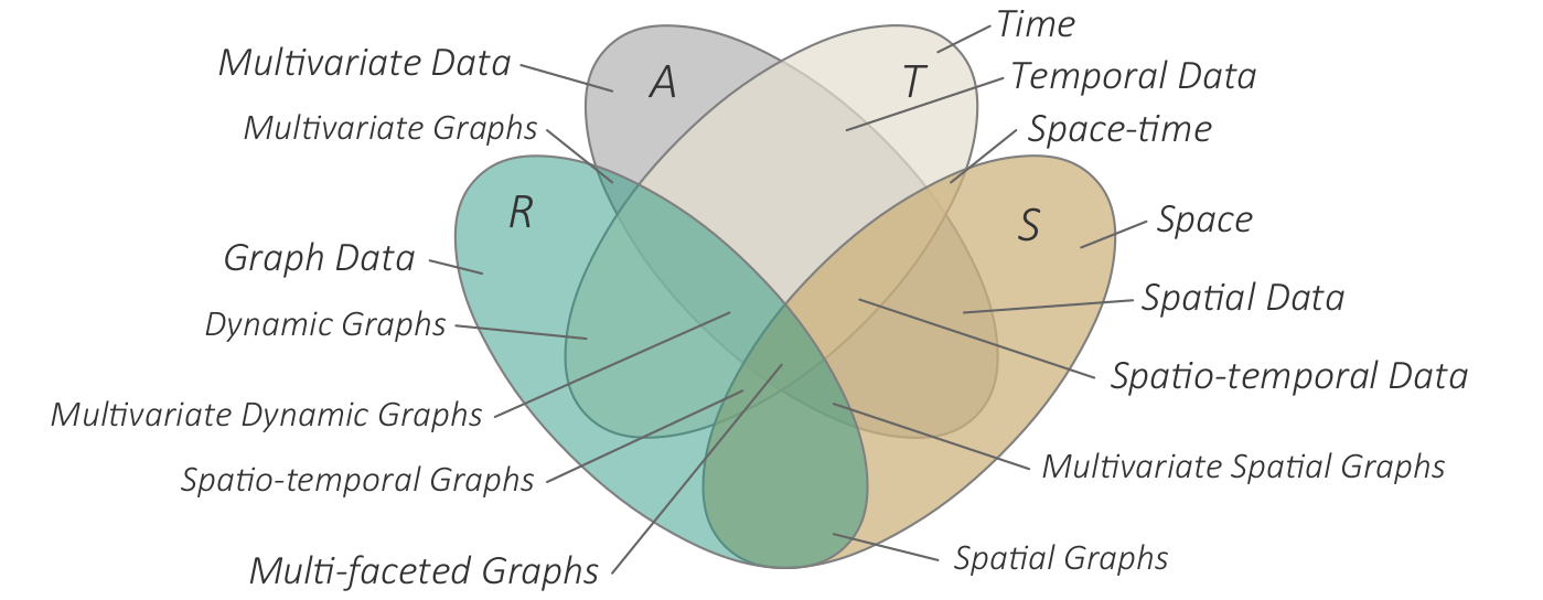
Four-set Venn diagram illustrating different classes of data.
Figure
Original book figure.
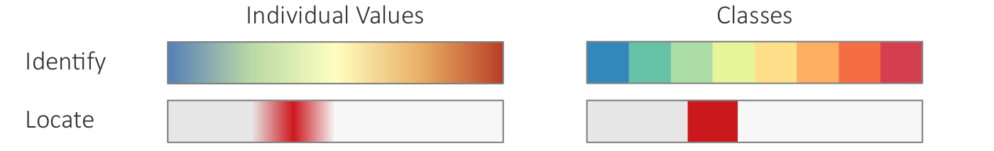
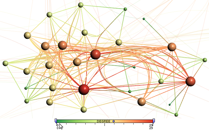
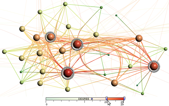
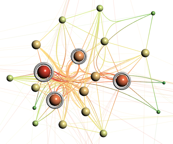
Different visual encodings to support different tasks. (a) Coloring suited to identifying values.
Figure
Original book figure.
Different visual encodings to support different tasks. (b) Coloring suited to locating extrema.
Figure
Original book figure.
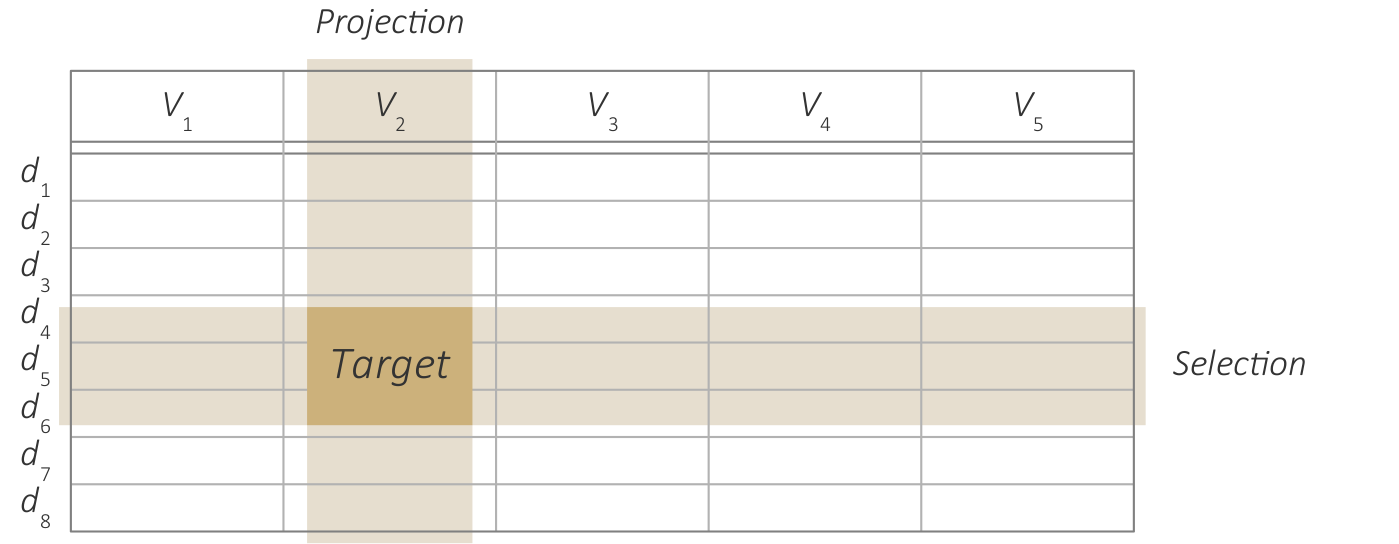
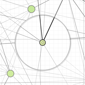
A target as defined by projection and selection.
Figure
Original book figure.
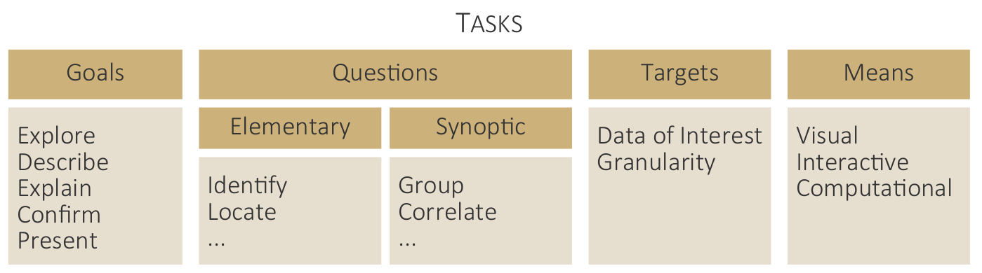
Goals, questions, targets, and means characterize analysis tasks.
Figure
Original book figure.
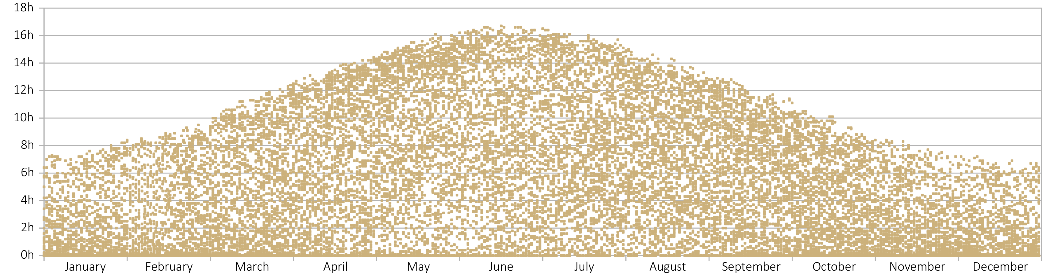
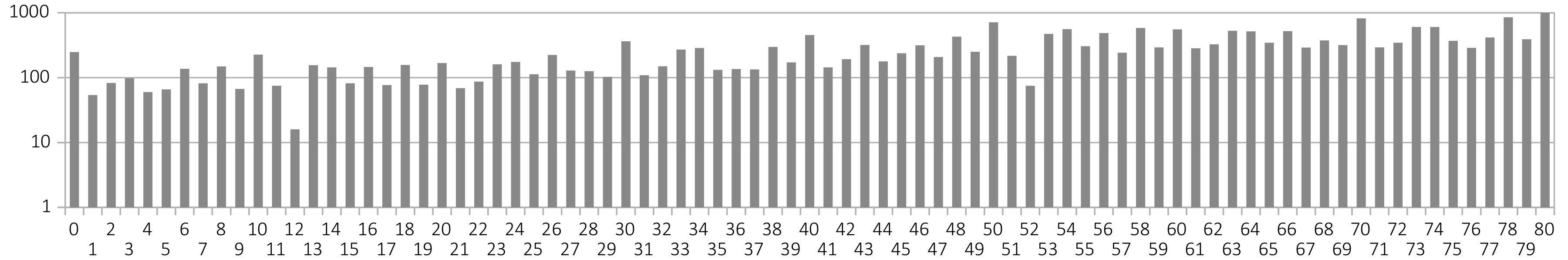
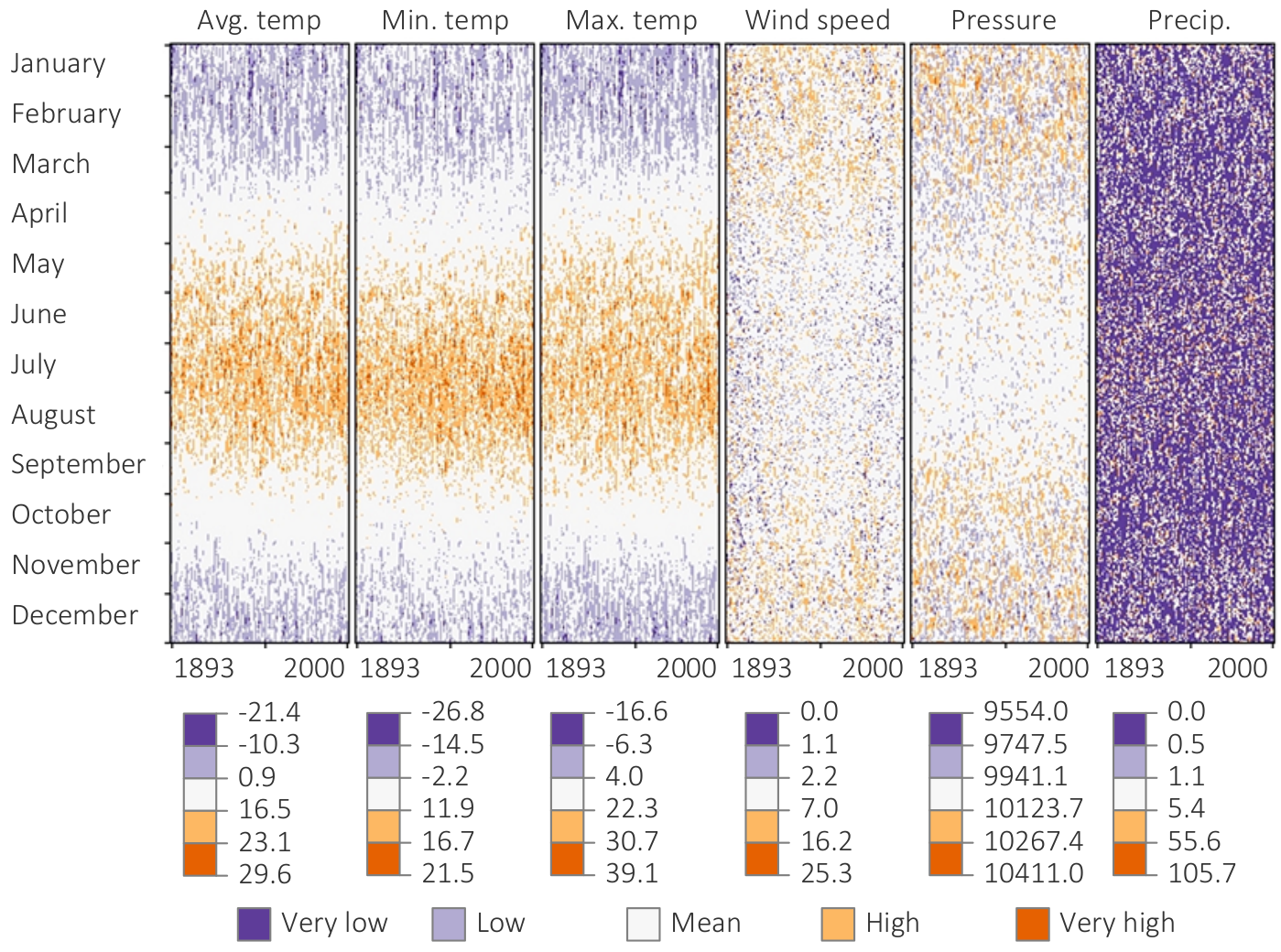
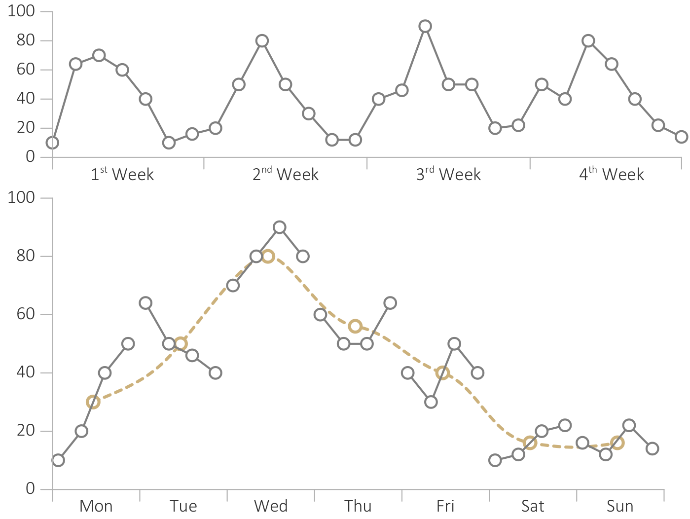
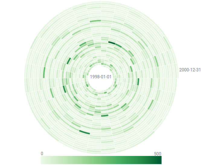
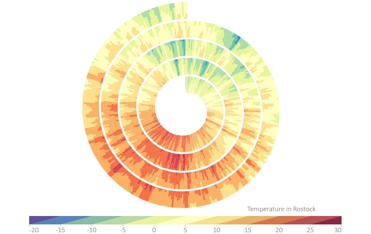
Meteorological measurements over the course of the year. (a) Hours of sunshine.
Figure
Original book figure.
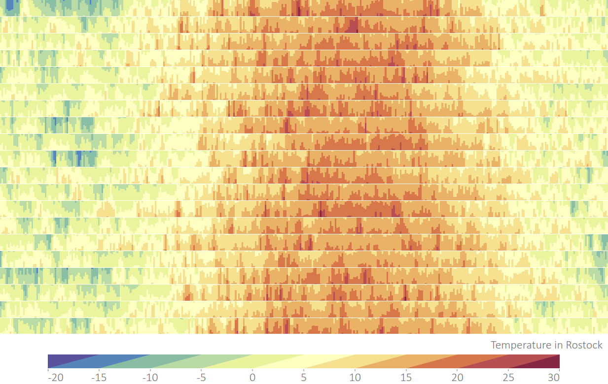
Meteorological measurements over the course of the year. (b) Air temperature.
Figure
Original book figure.
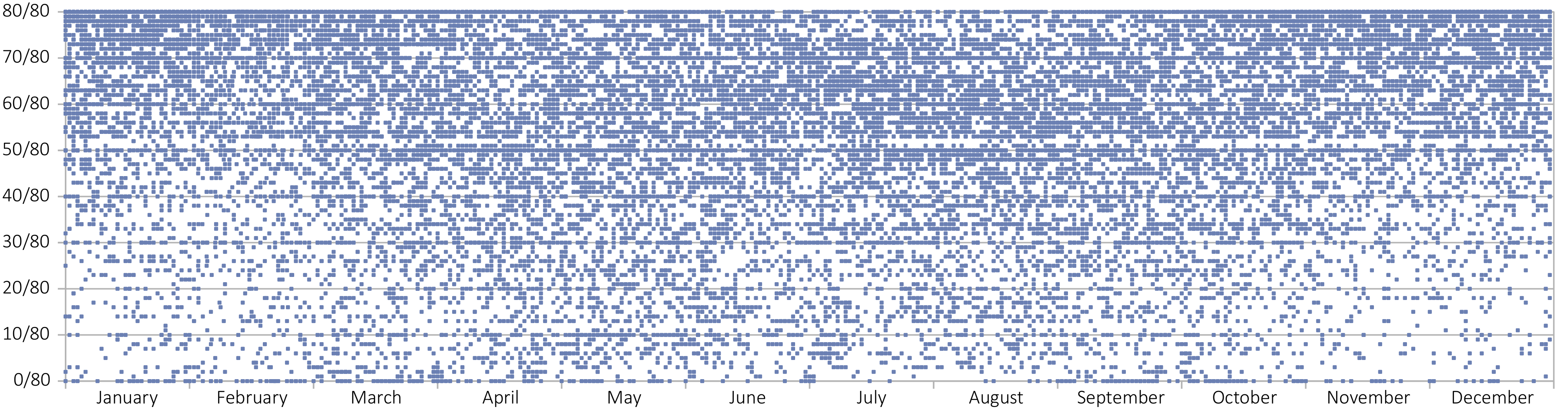
Meteorological measurements over the course of the year. (c) Cloud cover.
Figure
Original book figure.
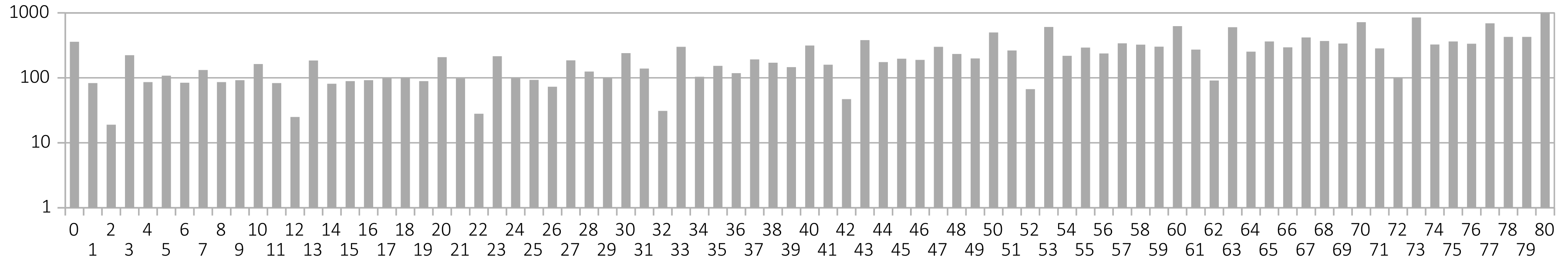
Histograms of the distribution of cloud cover values. (a) Cloud cover value frequencies in Rostock.
Figure
Original book figure.
Histograms of the distribution of cloud cover values. (b) Cloud cover value frequencies in Dresden.
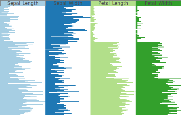
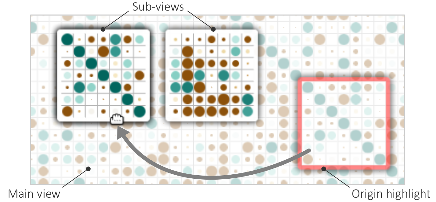
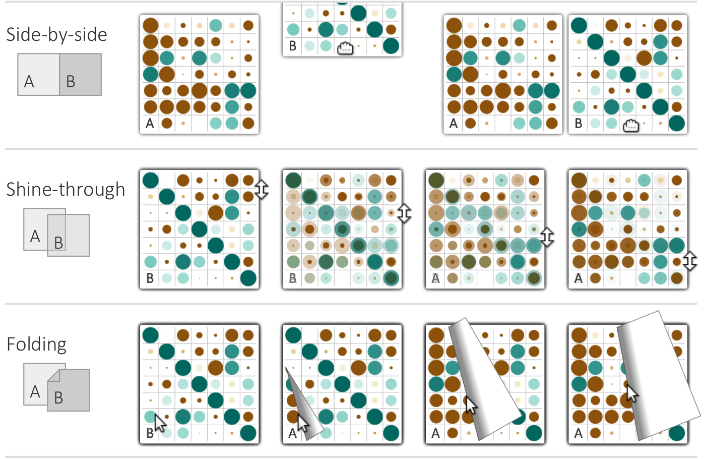
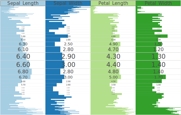
Illustration of focus+context for a table-based visualization of the Iris flower dataset. Focused rows are magnified to accommodate labels. (a) Regular visualization.
Figure
Original book figure.
Illustration of focus+context for a table-based visualization of the Iris flower dataset. Focused rows are magnified to accommodate labels. (b) Focus+context distortion of rows.
Figure
Original book figure.
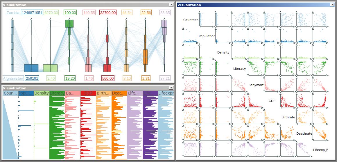
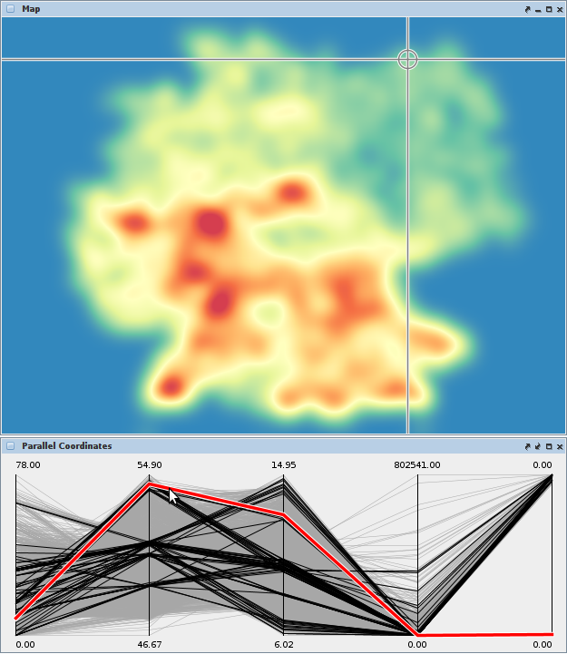
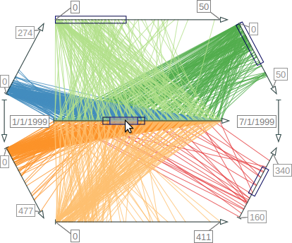
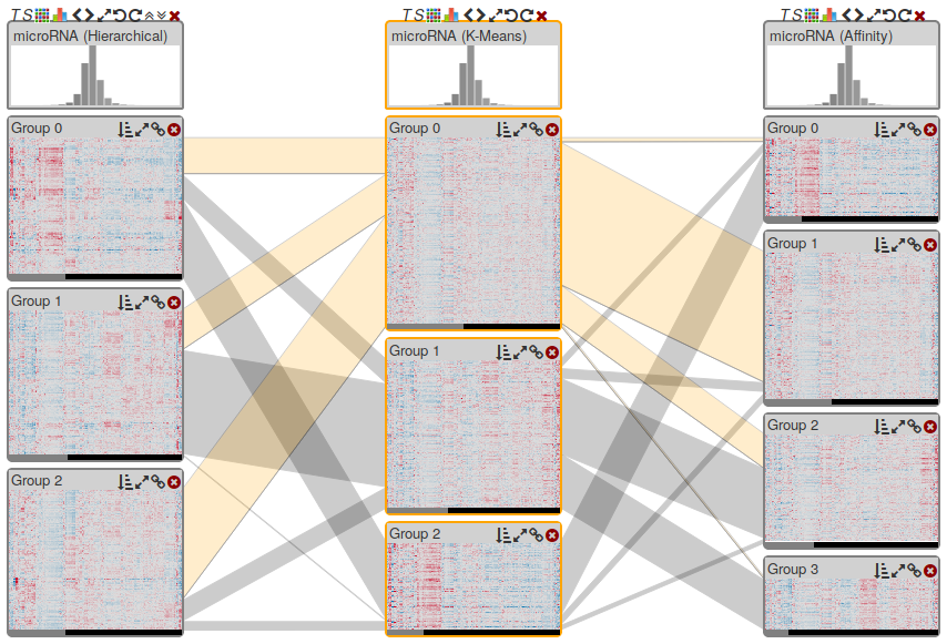
Multiple coordinated views for analyzing multivariate data.
Figure
Original book figure.
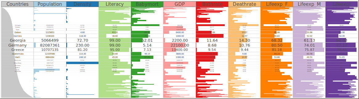
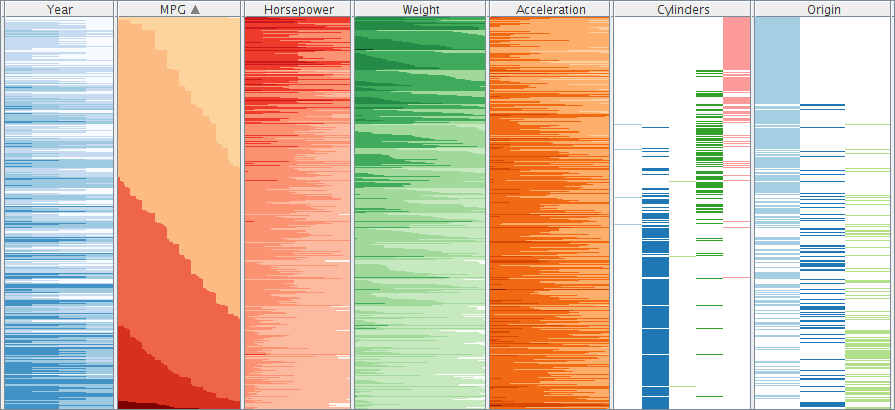
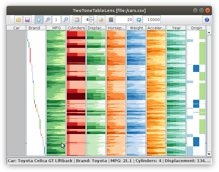
Two-tone colored table-based visualization of the Cars dataset.
Figure
Original book figure.
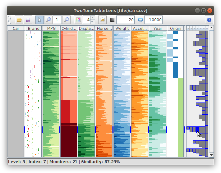
Table Lens with textual labels for focused data tuples.
Figure
Original book figure.
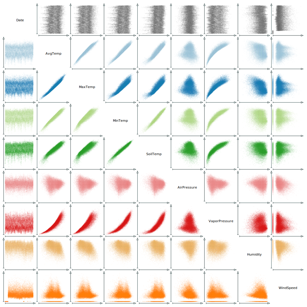
9 × 9 scatter plot matrix of meteorological data. Color is used to ease the recognition of data variables.
Figure
Original book figure.
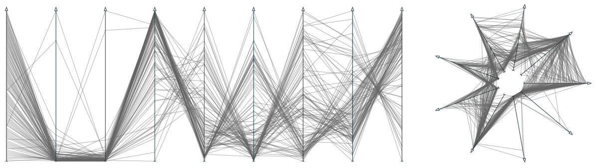
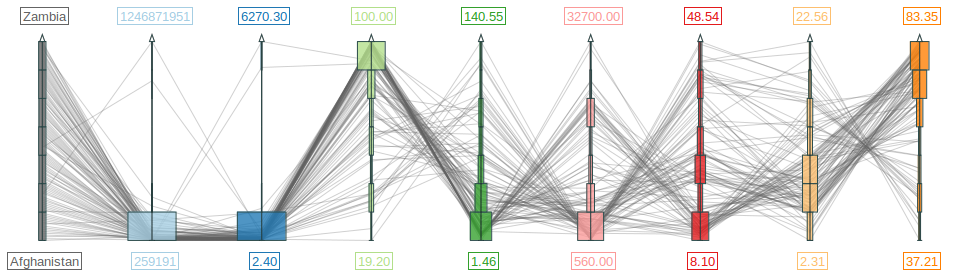
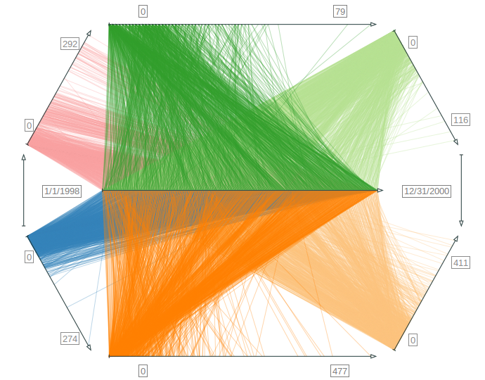
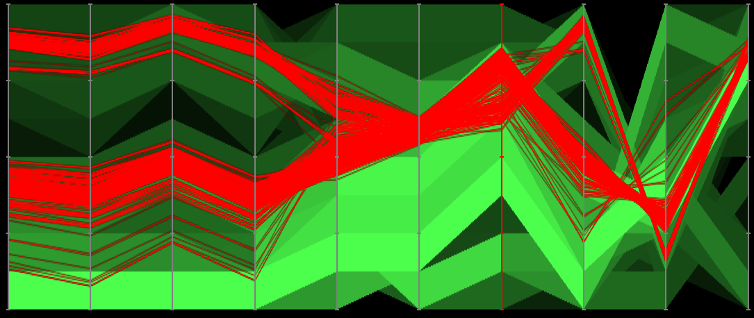
Visualization with polylines across parallel and star-shaped axes. (a) Parallel coordinates plot. (b) Radar chart.
Figure
Original book figure.
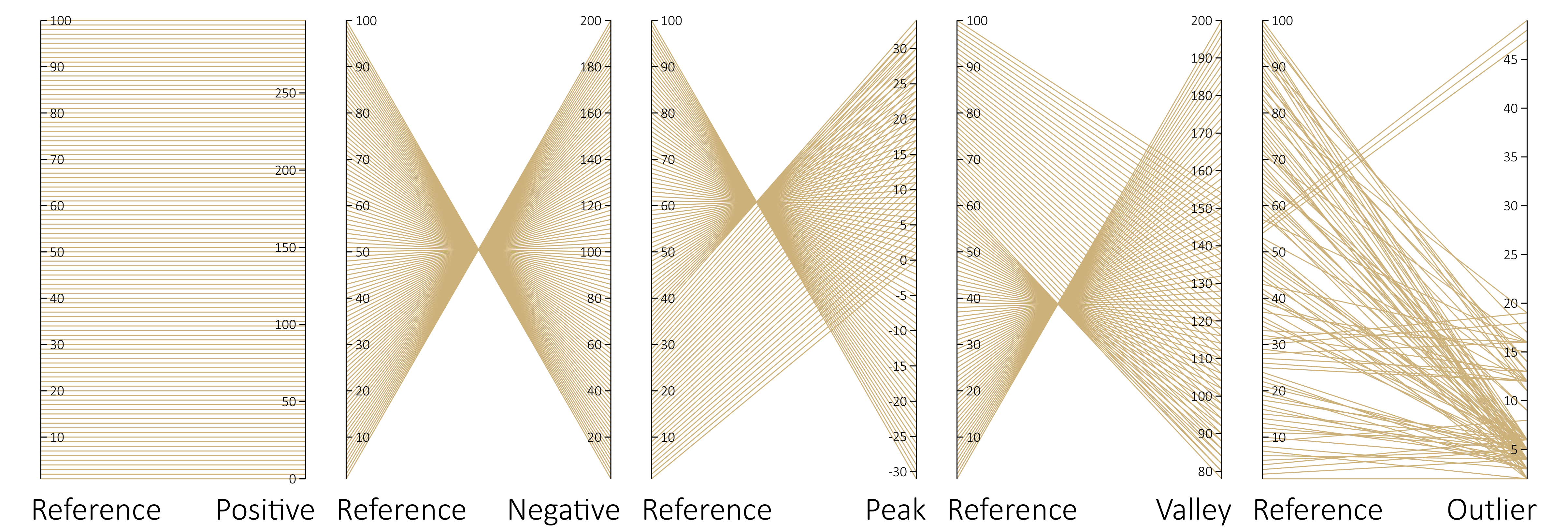
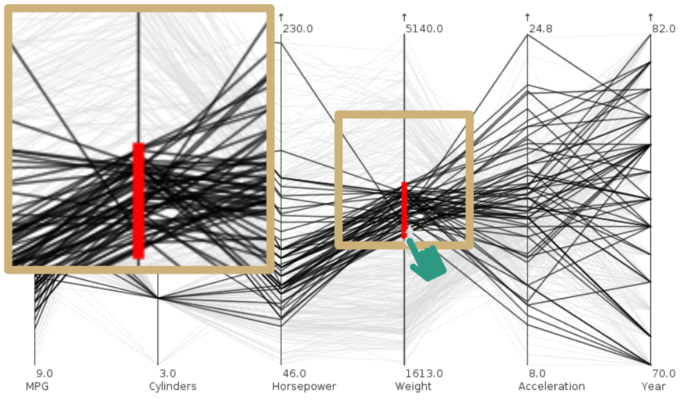
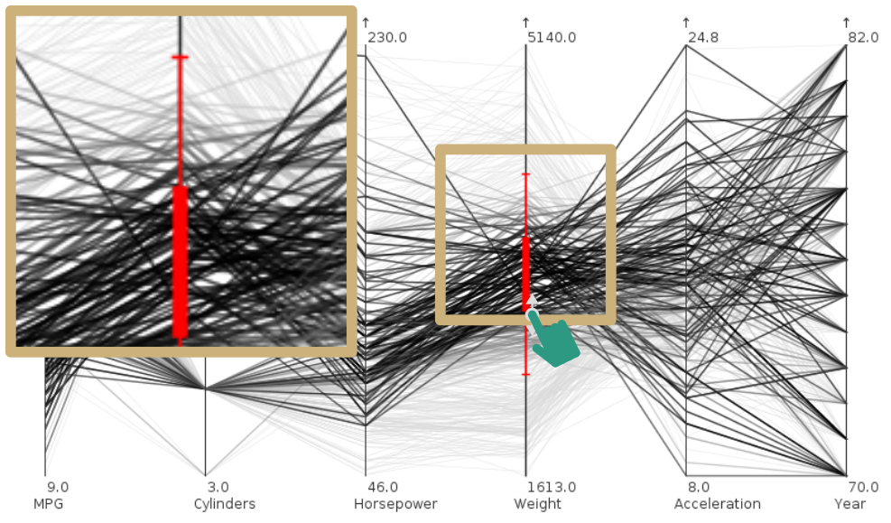
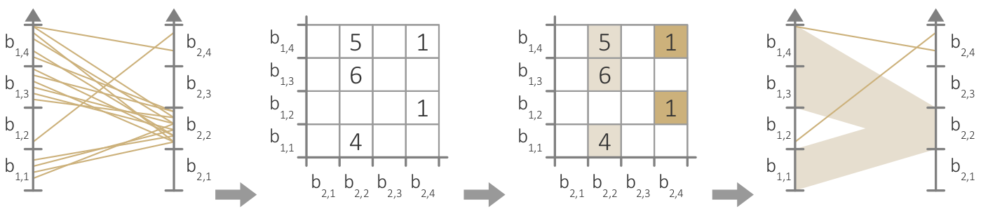
Visual patterns between pairs of parallel axes.
Figure
Original book figure.
The same data as in Figure 3.19 visualized as scatter plots.
Figure
Original book figure.
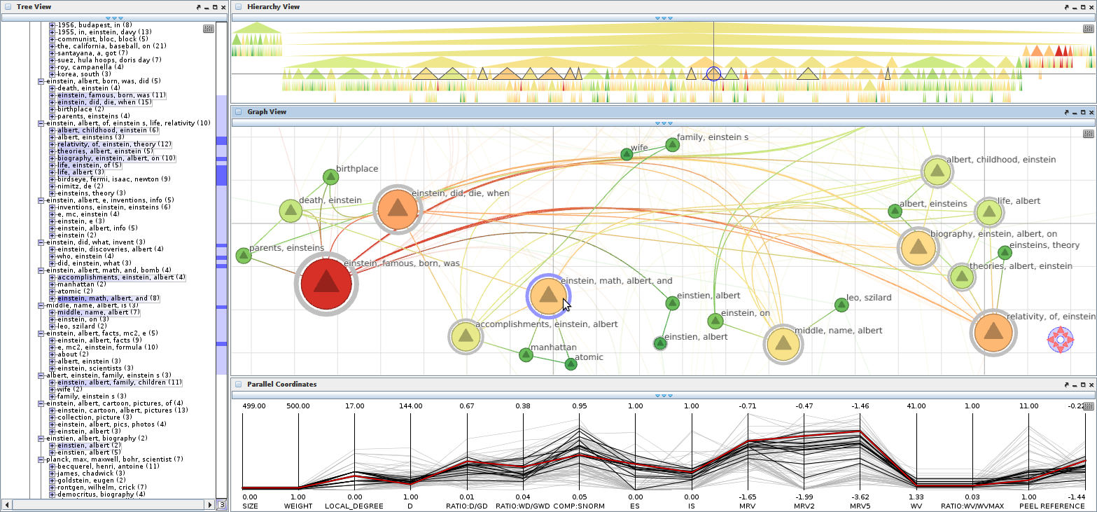
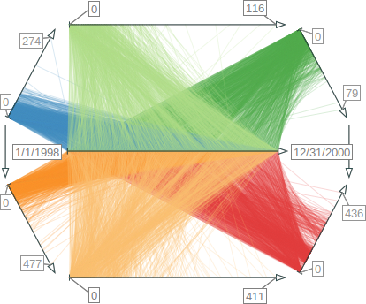
Parallel coordinates with histograms showing demographic data.
Figure
Original book figure.
Examples of classic glyphs for visualization. (a) Autoglyph. (b) Stick figures. (c) Chernoff faces.
Figure
Original book figure.
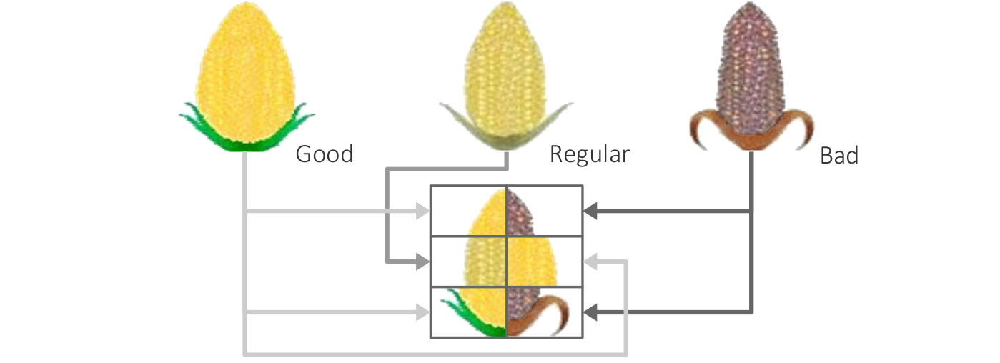
Corn glyph for representing six ordinal data values.
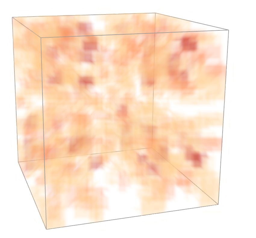
Comparison of direct volume visualization of the particle concentration of one protein and ellipsoid-based visualization of features representing high concentrations of two different proteins. (a) Volume visualization.
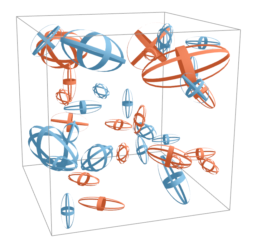
Comparison of direct volume visualization of the particle concentration of one protein and ellipsoid-based visualization of features representing high concentrations of two different proteins. (b) Ellipsoid visualization.
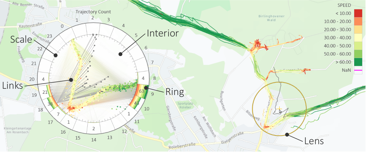
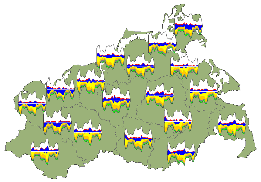
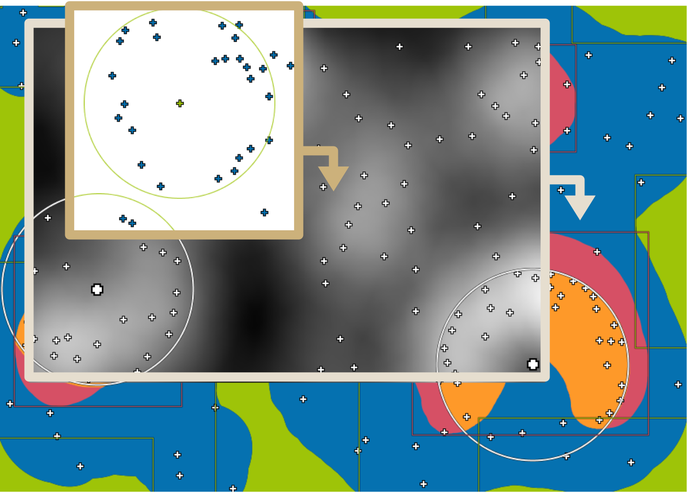
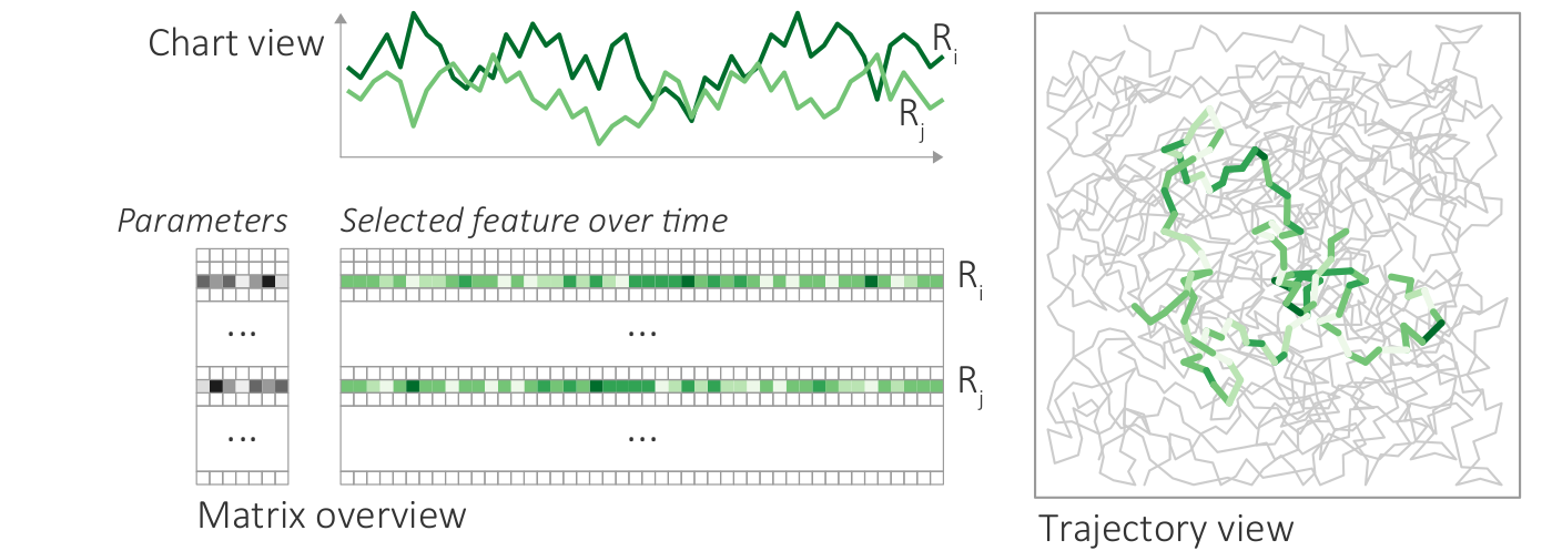
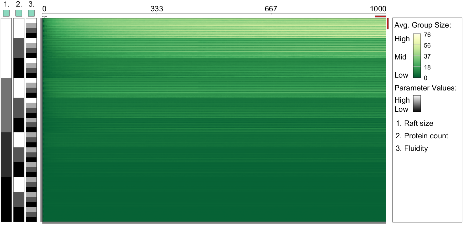
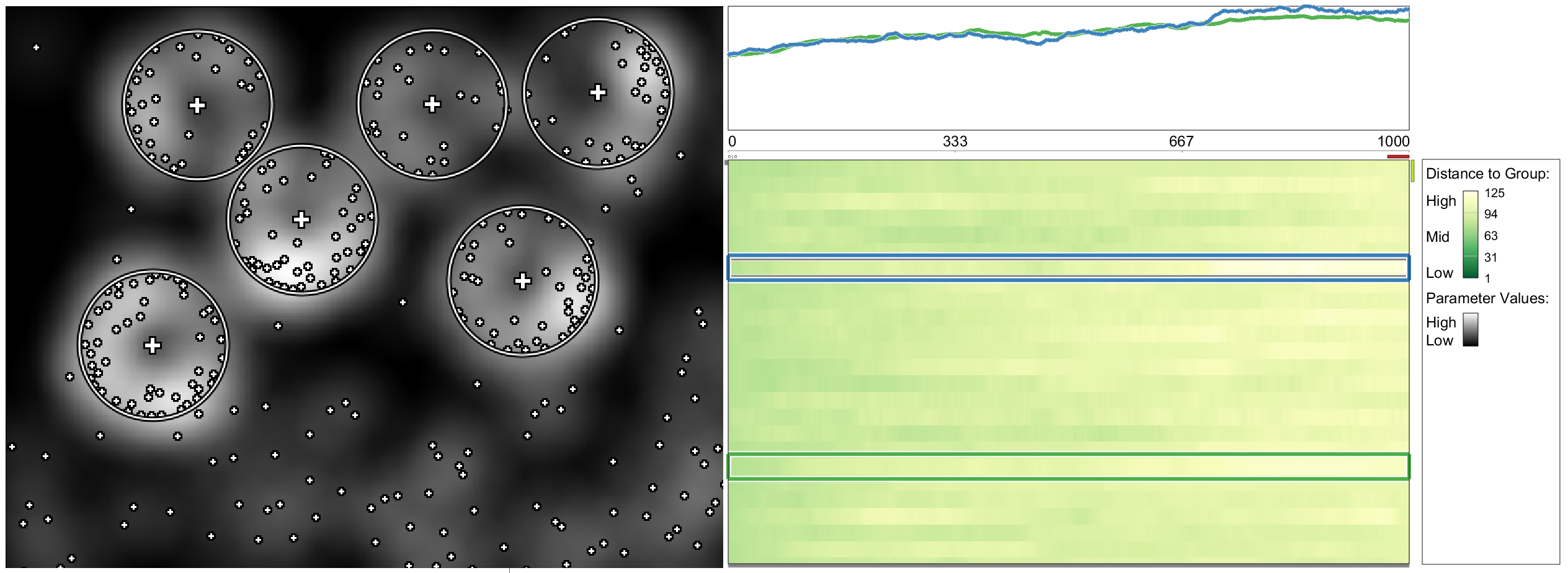
Visualization of parameter settings, feature values, and detail information for selected parts of the data. (a) Parameter settings as gray-scale matrix; (b) Feature values over time as color-coded matrix; (c) Chart with selected time series; (d) Trajectory view with selected trajectory segments.
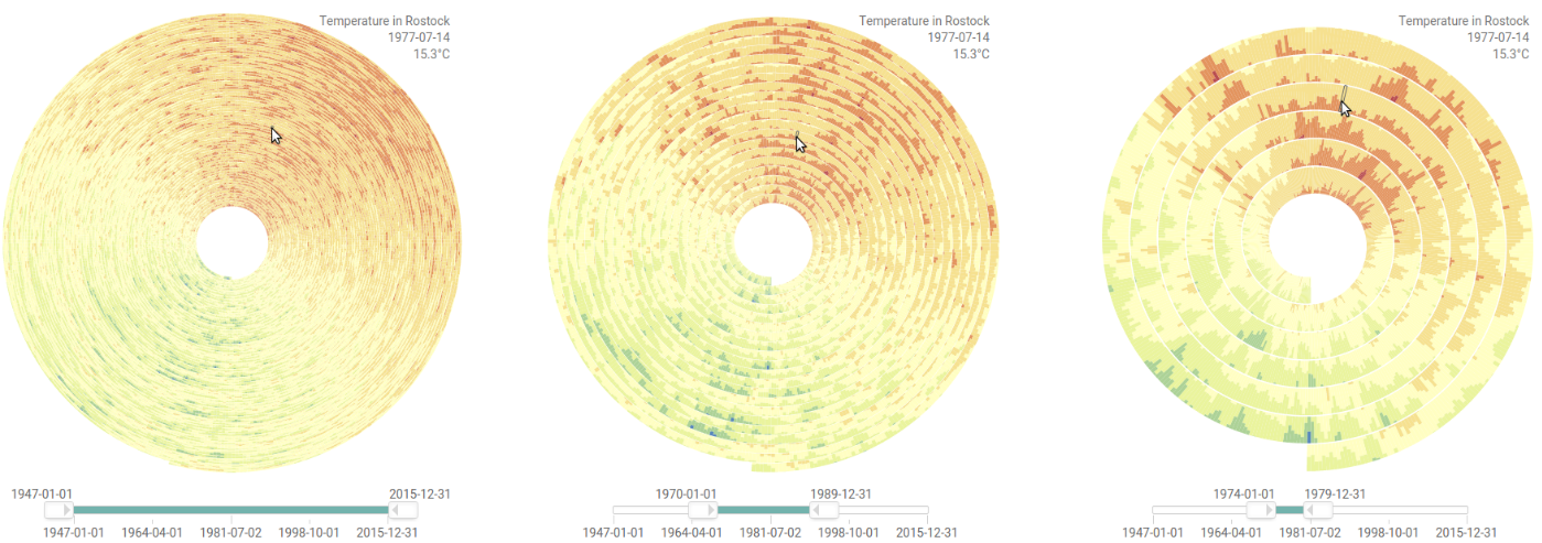
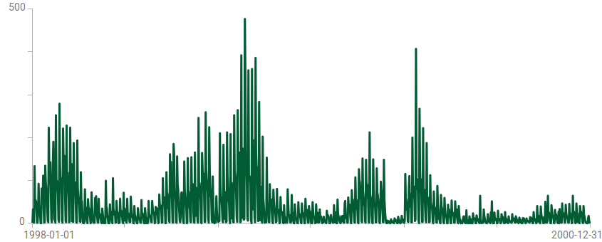
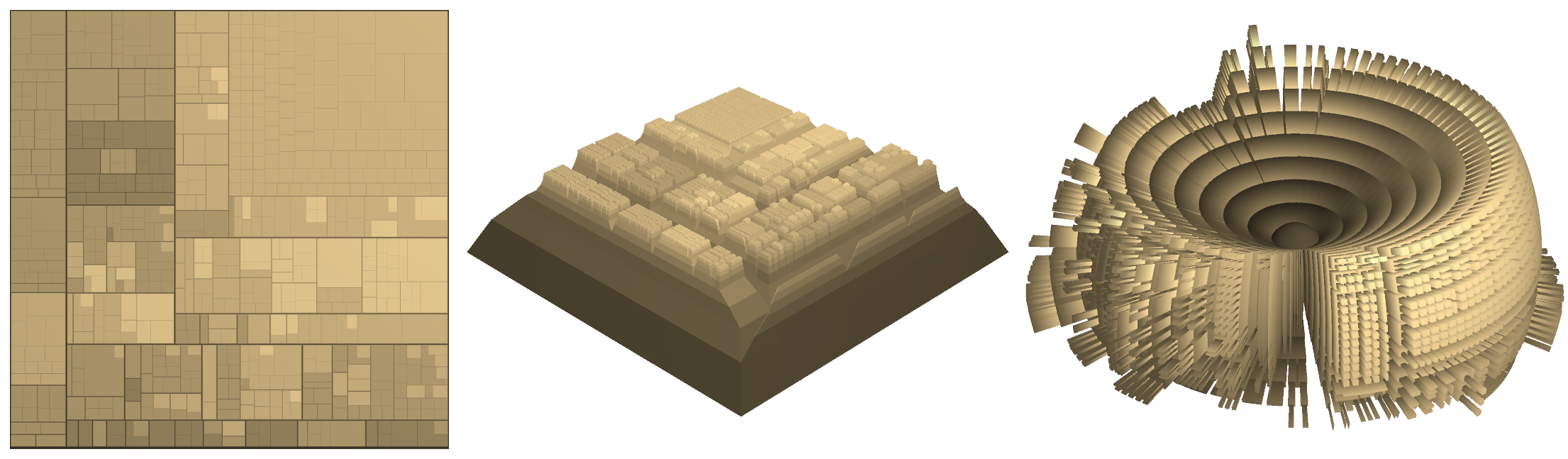
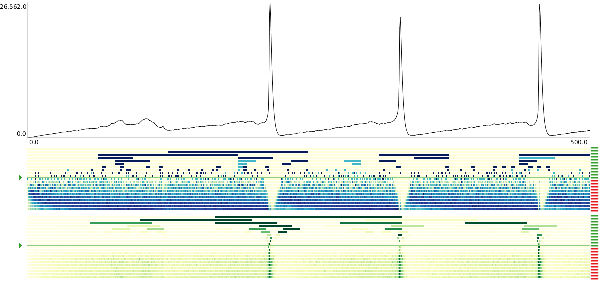
Visualization of a time series with more than 1.7 million time points, where each black pixel represents about 1,000 data points.
Figure
Original book figure.
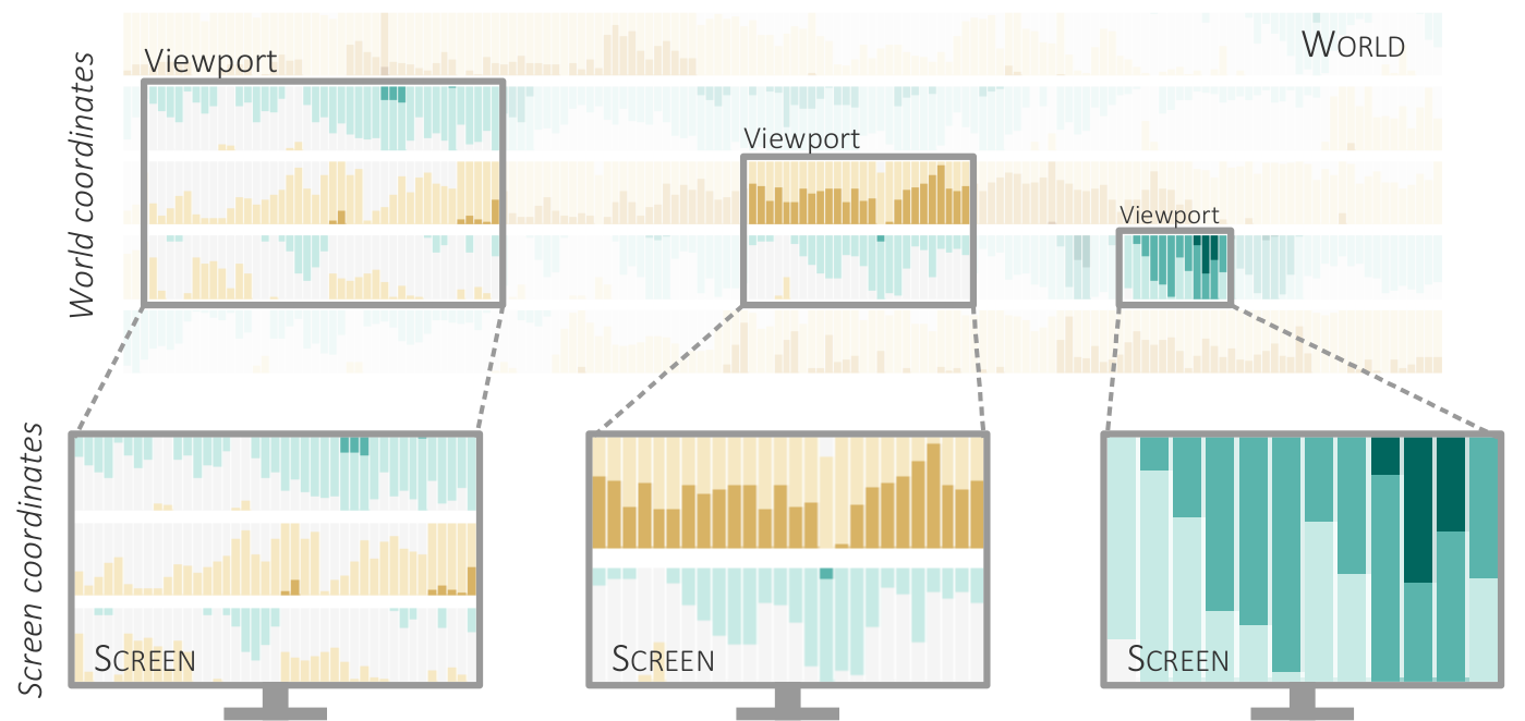
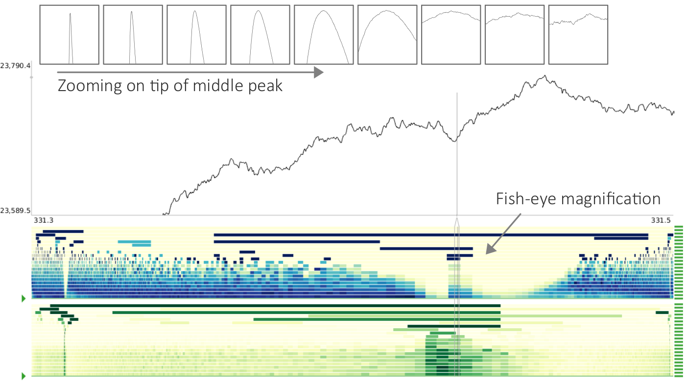
One and the same time series at two different scales.
Figure
Original book figure.
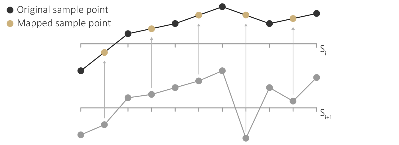
Unifying the sample points of two successive scales by mapping and interpolation.
Figure
Original book figure.
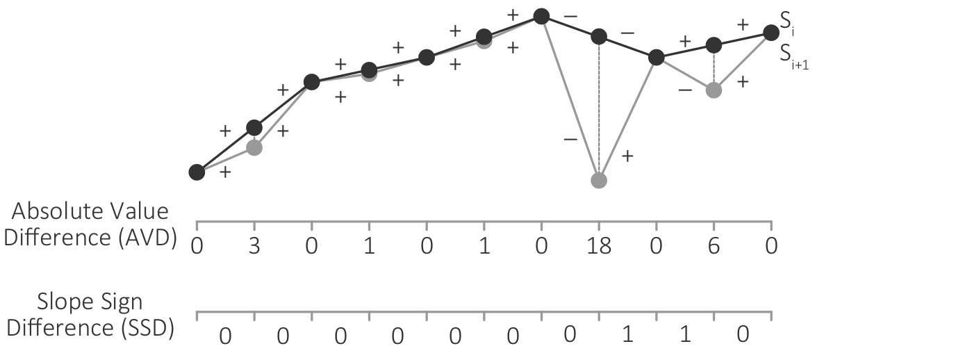
Computing the absolute value difference (AVD) and the slope sign difference (SSD) between two successive data scales.
Figure
Original book figure.
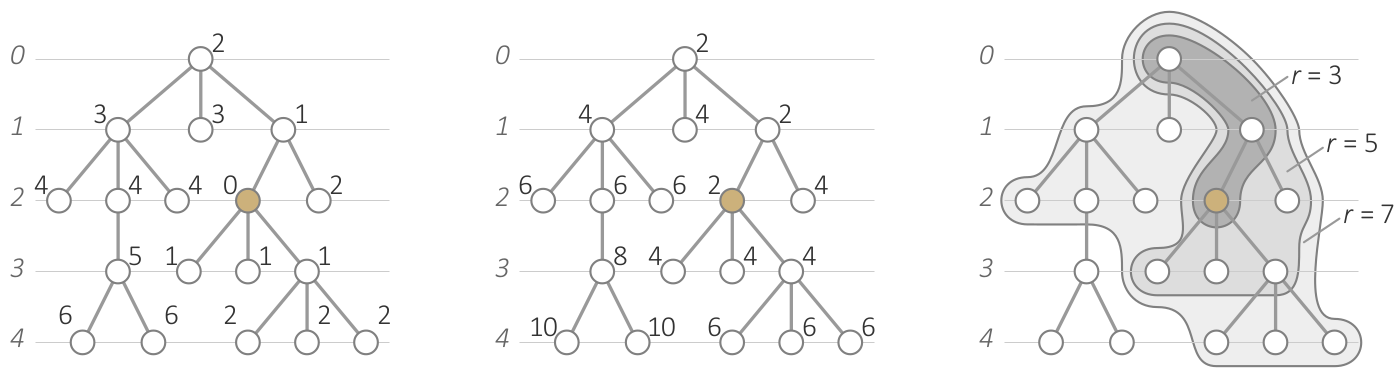
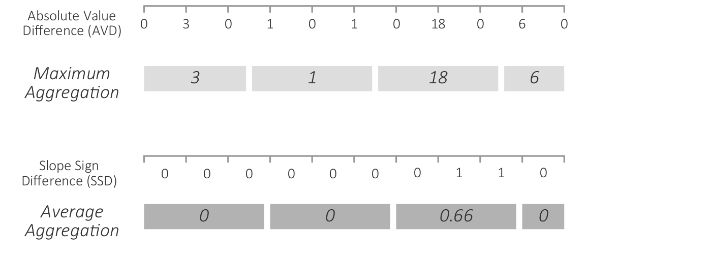
Aggregation of data differences with maximum aggregation for the absolute value difference (AVD) and average aggregation for the slope sign difference (SSD) function.
Figure
Original book figure.
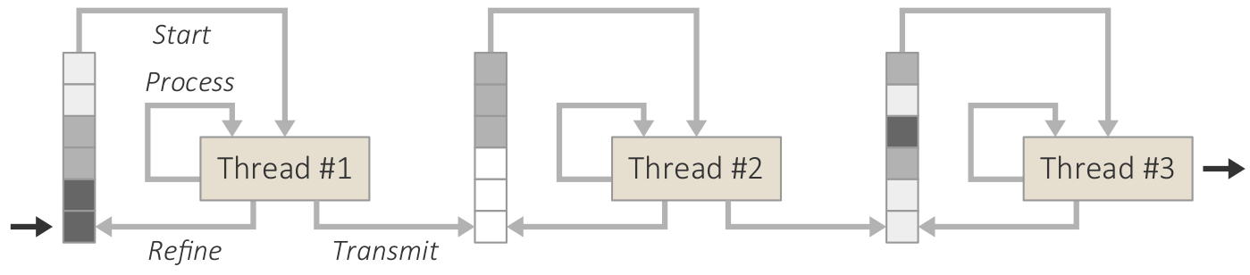
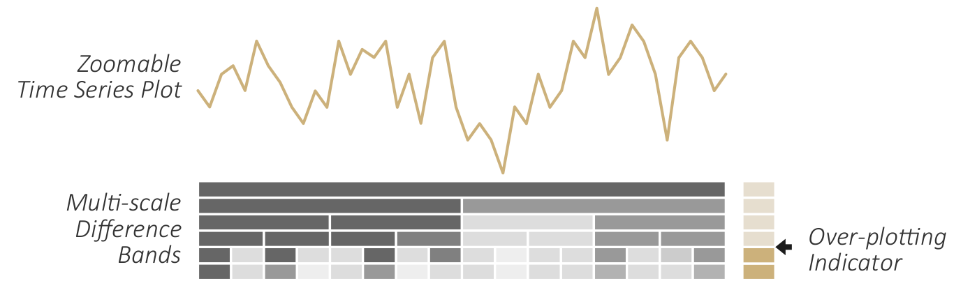
Visualizing aggregated differences along with the actual data.
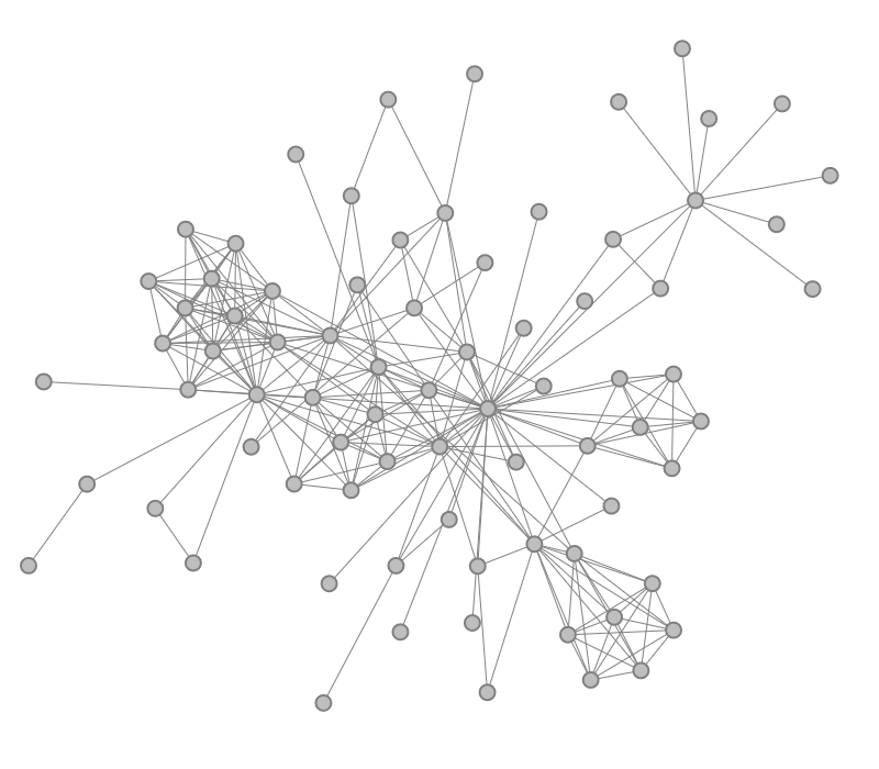
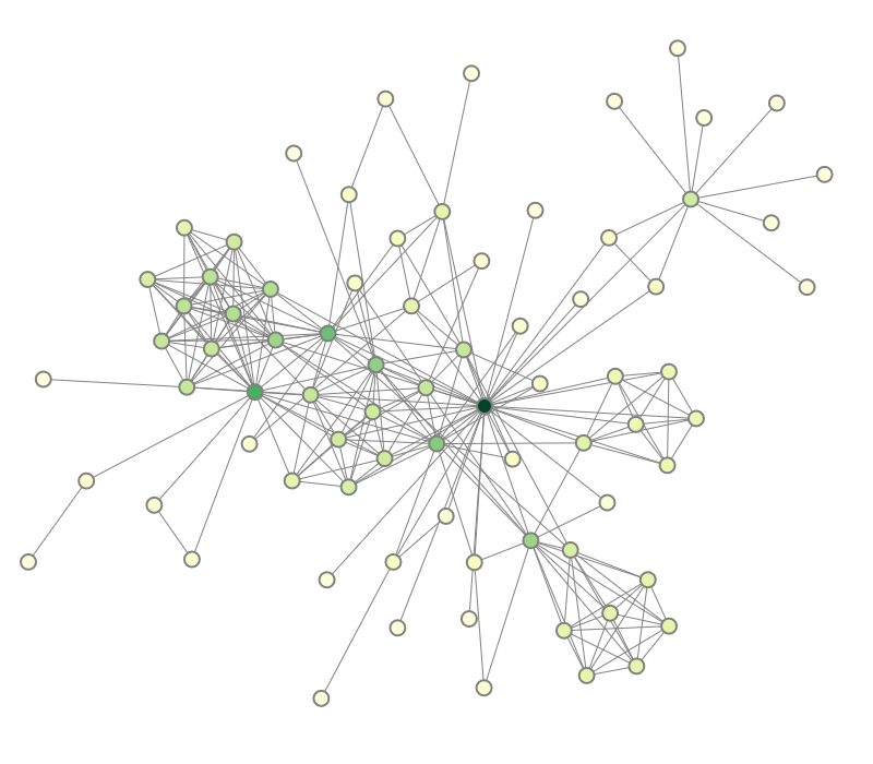
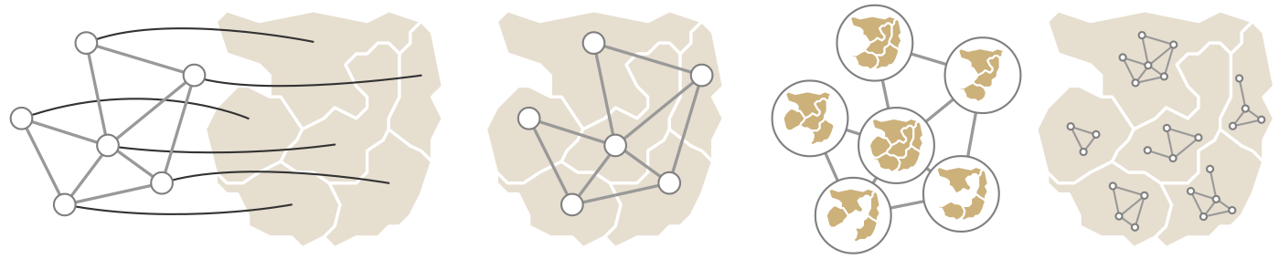
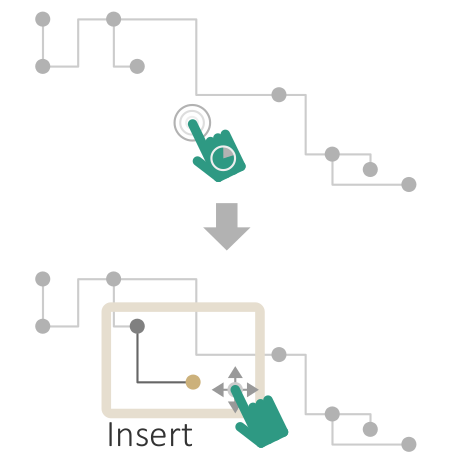
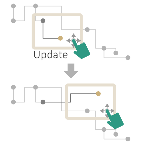
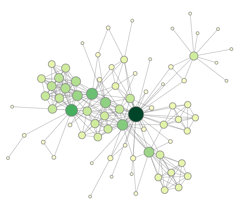
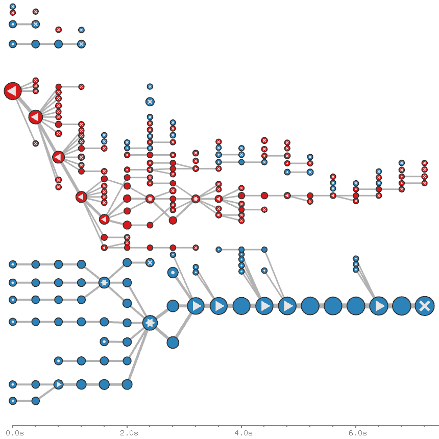
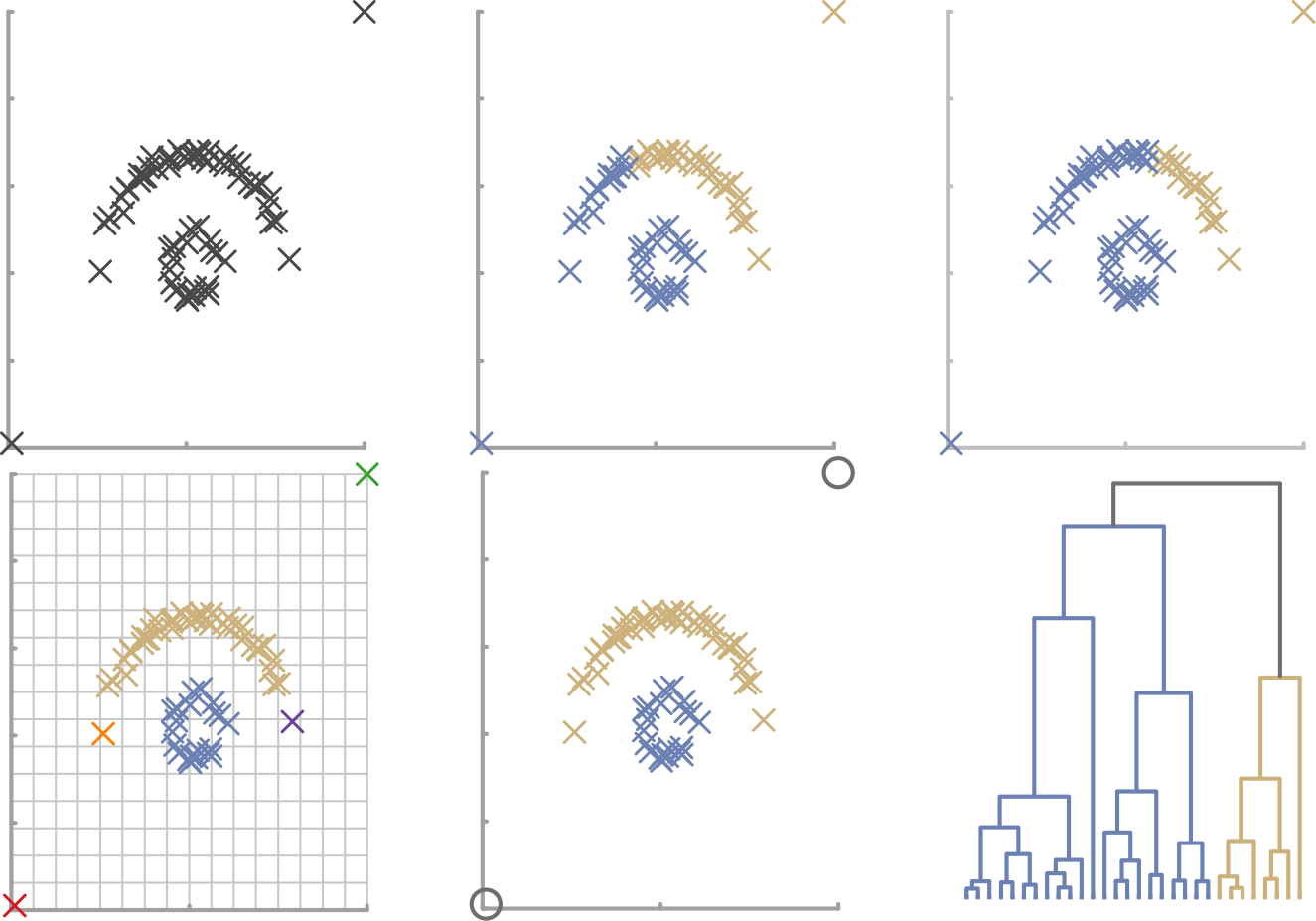
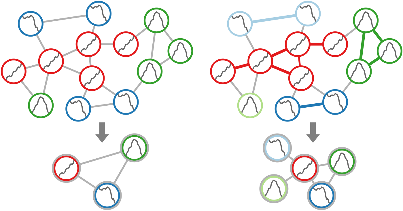
Two-step procedure of clustering nodes based on their attributes. First, nodes with similar attribute behavior are grouped. Second, groups are refined based on connected components. (a) Initial grouping. (b) Refined clusters.
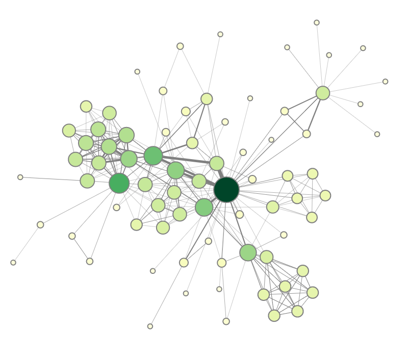
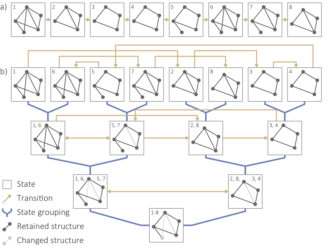
Structure-based clustering. (a) Initial set of states and transitions based on the sequence of graphs Gi in DG; (b) Hierarchical grouping of states and transitions based on similar structures.
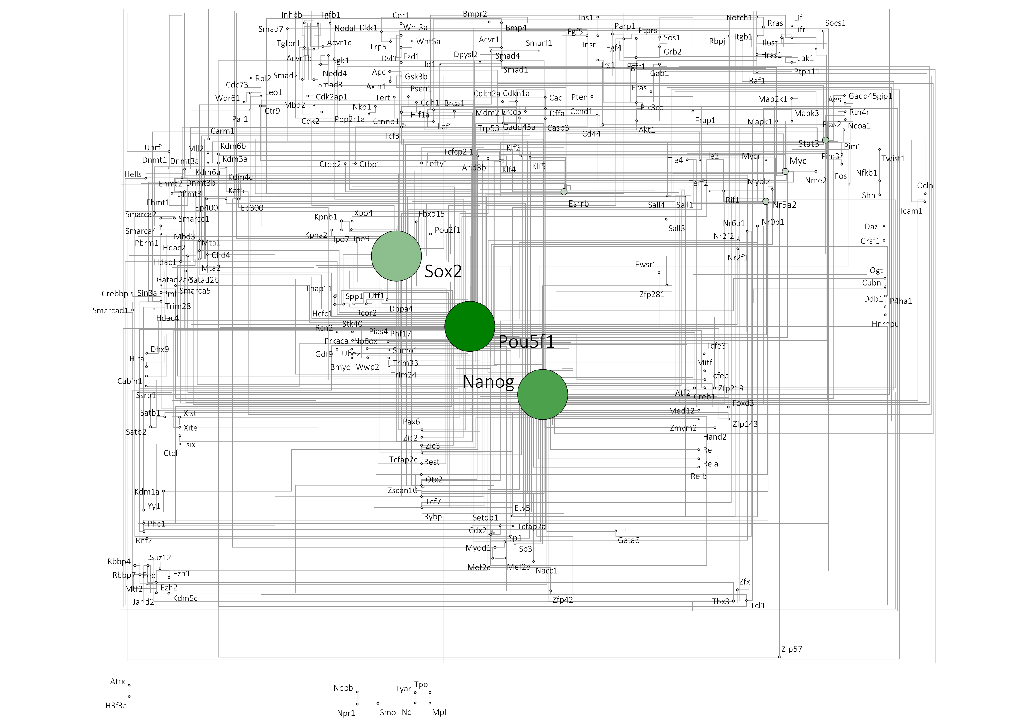
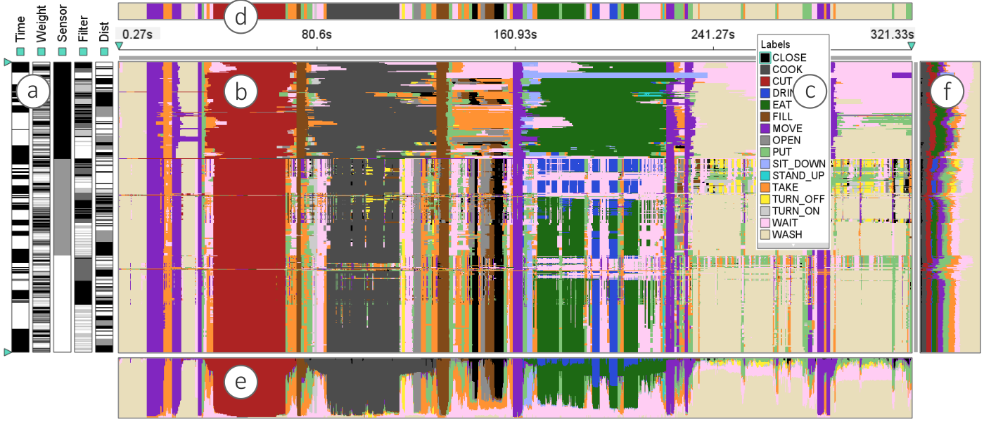
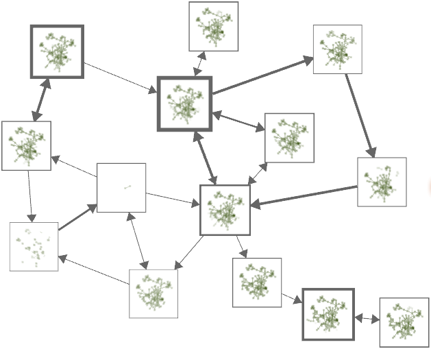
Analyzing a wireless network supported by structure-based clustering. (a) State-transition graph; (b) Average link quality of selected state; (c) Representative graph structure of selected state.
Figure
Original book figure.
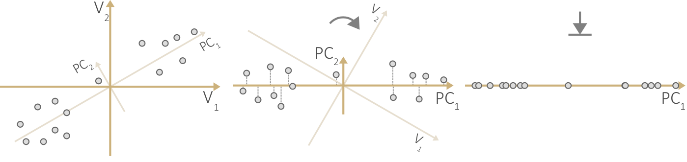
Reducing dimensionality with principal component analysis. (a) Original data space. (b) Principal component space. (c) Reduced space.
Figure
Original book figure.
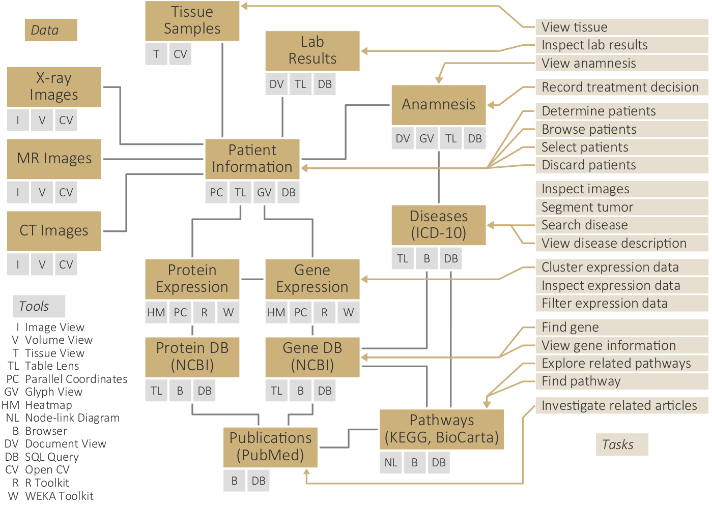
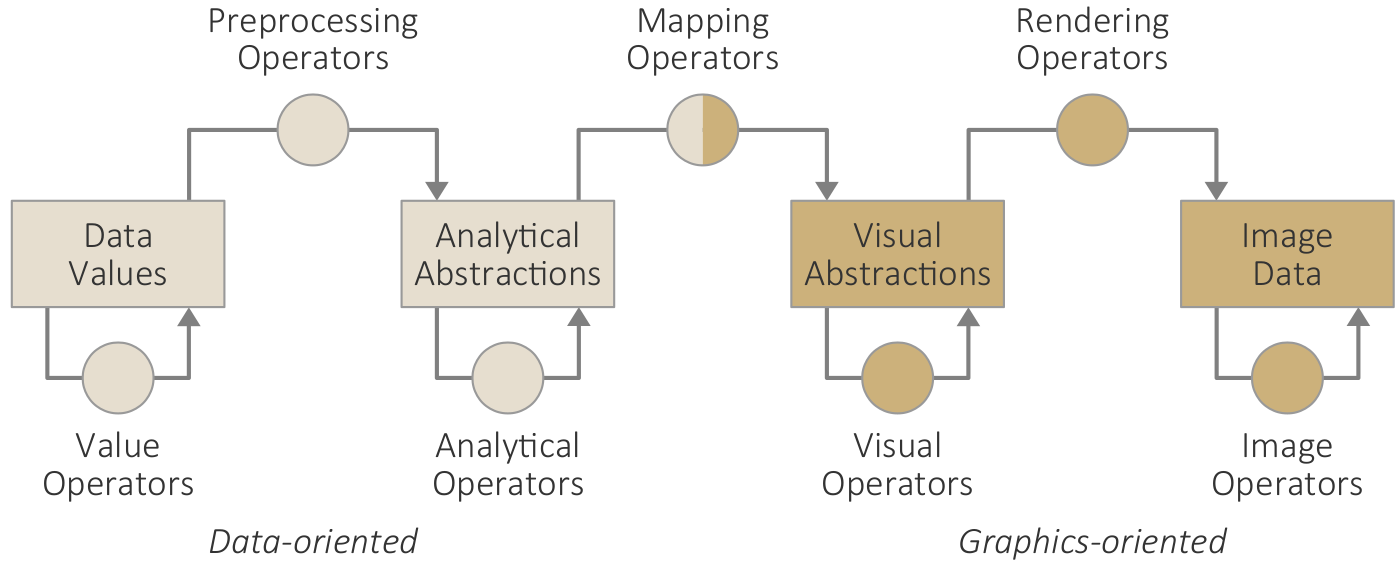
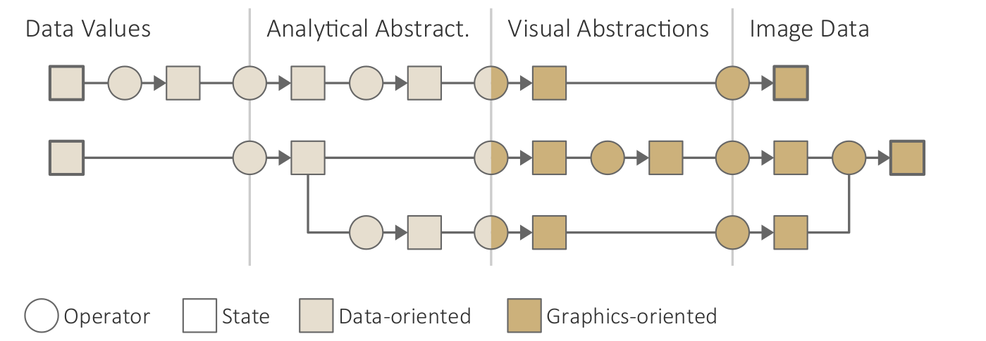
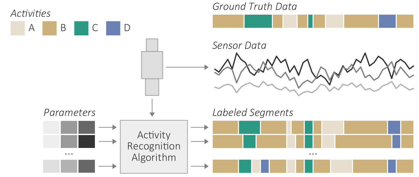
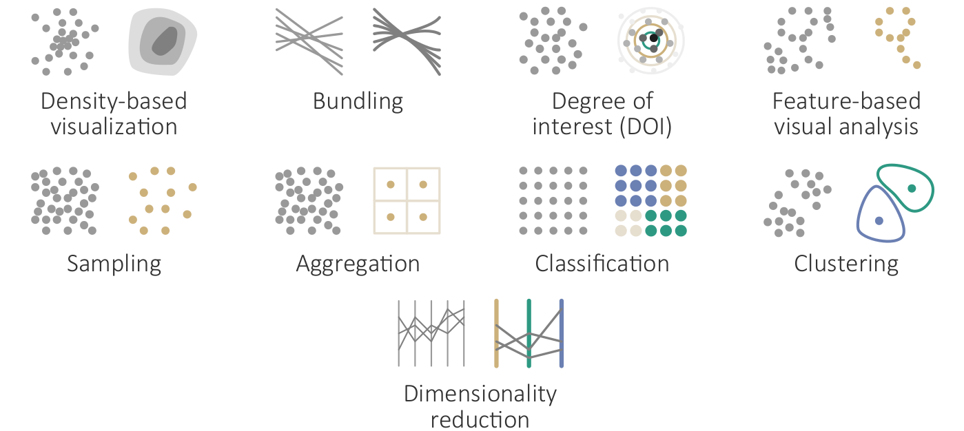
Overview of automatic computational methods to support interactive visual data analysis by reducing the complexity of the data and their visual representations.
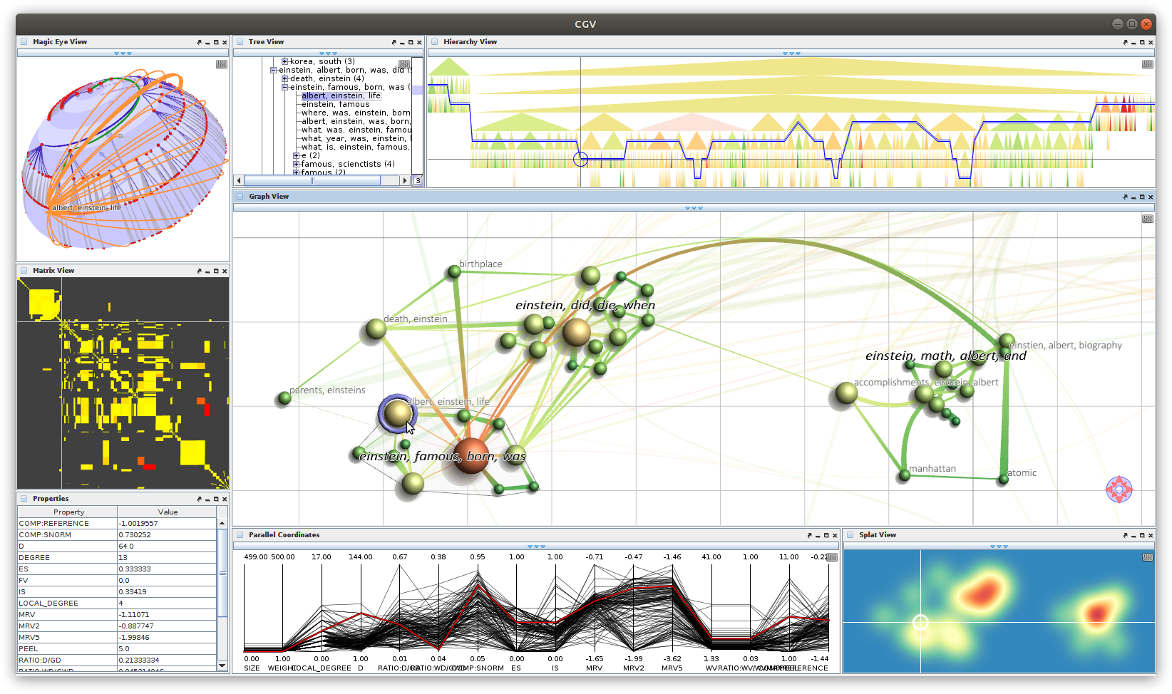
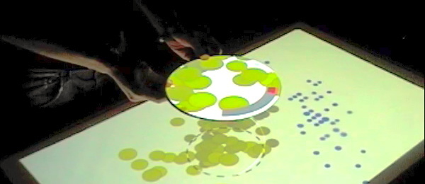
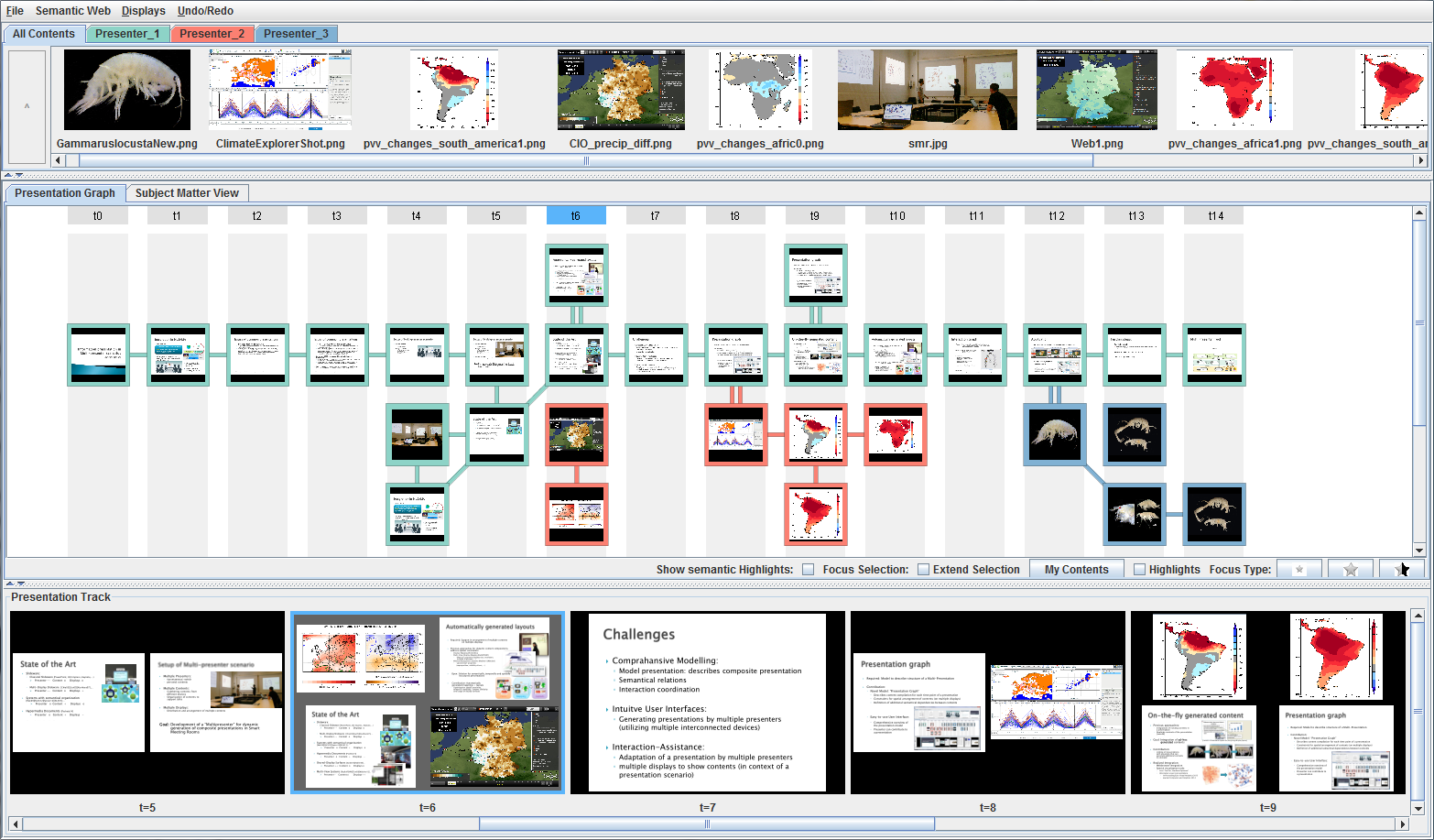
Graphical interface for creating and controlling multi-display visual analysis presentations, including content pool (top), logical presentation structure (middle), and preview (bottom).
Figure
Original book figure.
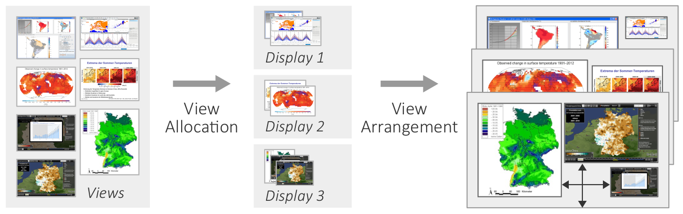
Basic two-step procedure of the automatic view layout.
Figure
Original book figure.
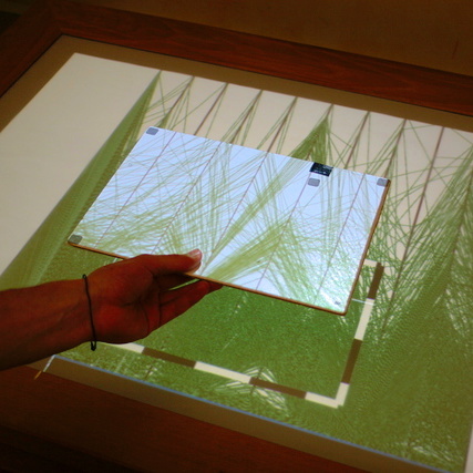
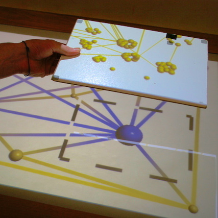
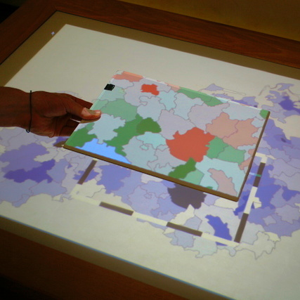
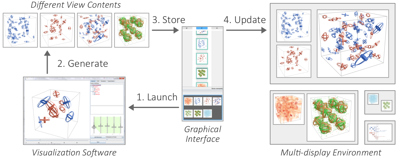
Changing the content of views by launching visualization software.
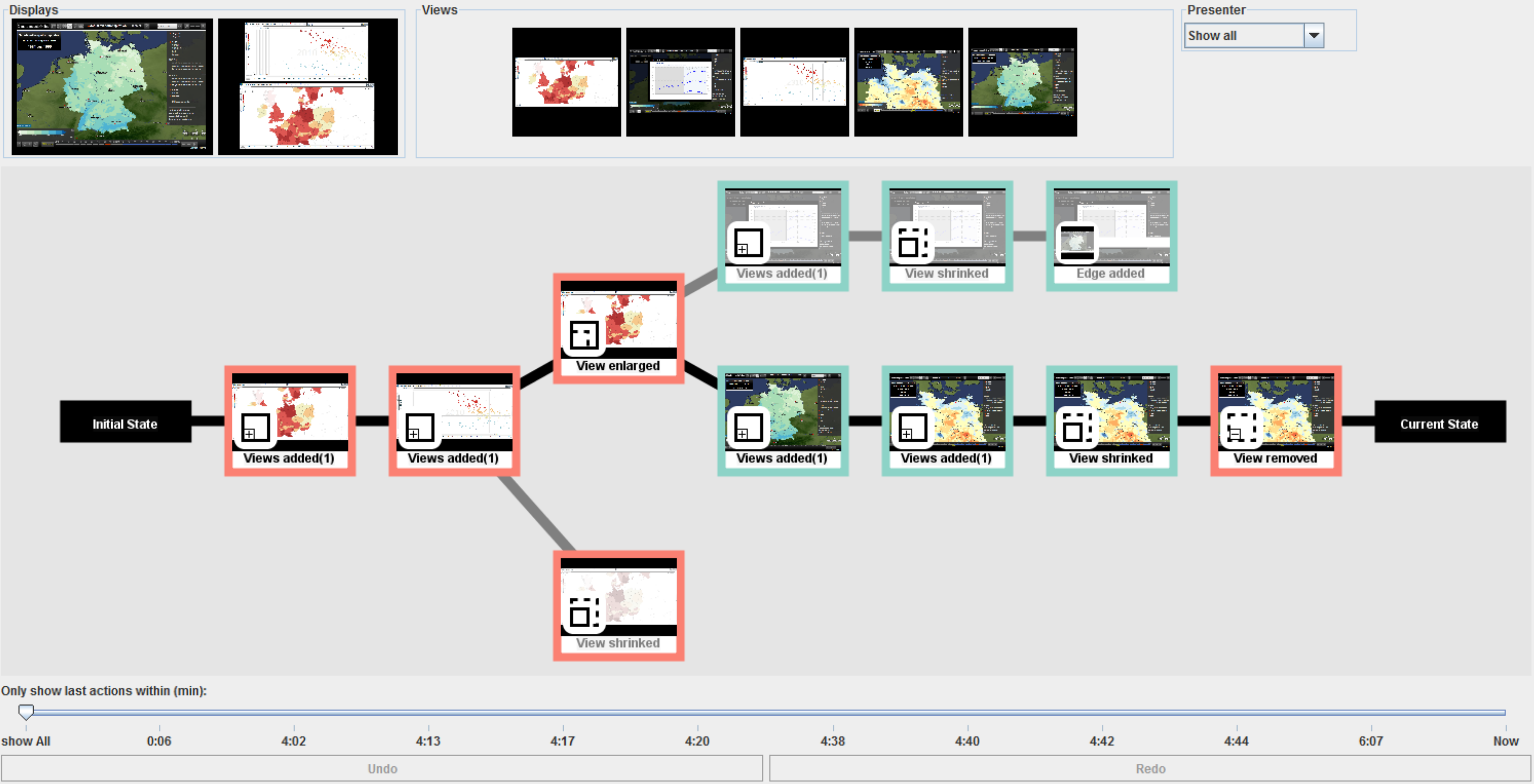
Graphical interface for analysis coordination and meta-analysis, including filtering support (top), analysis history graph (middle), and timeline with undo and redo buttons (bottom).
Figure
Original book figure.
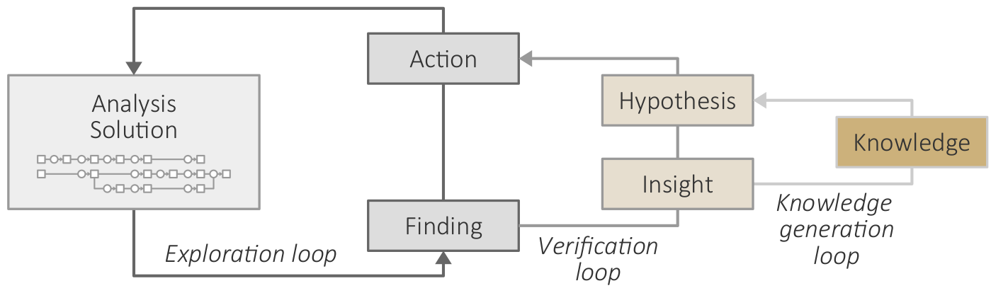
A knowledge gap exists when target or path is unknown.
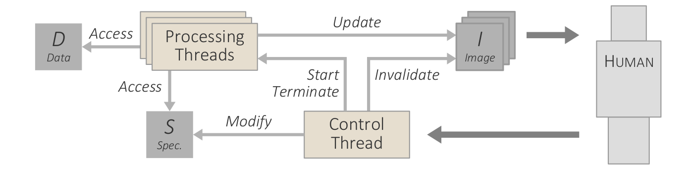
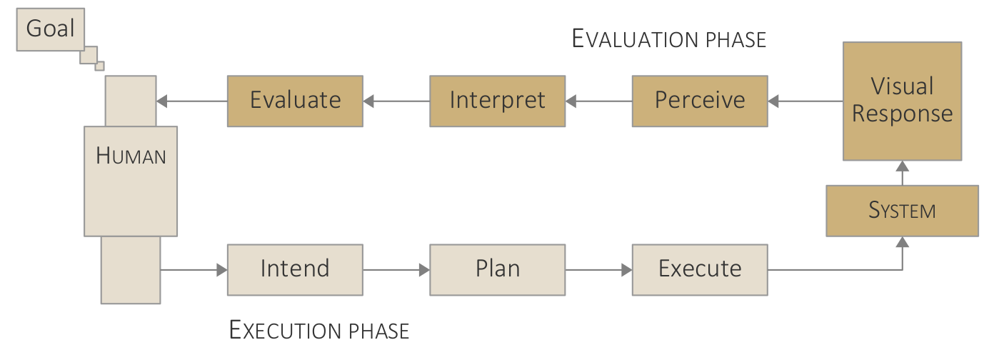
Adapted variant of van Wijk's model of visualization. Artifacts as boxes: data [D], specifications [S], visualization images [I], and user knowledge [K]. Functions as circles: analytic and visual transformation (T), perception and cognition (P), and interactive exploration (E).
Conceptual model of guided interactive visual data analysis. *Added artifacts and functions: domain conventions and models [D*], history and provenance [H*], visual cues [C*], options and alternatives [O*], and guidance generation (G*).
Figure
Original book figure.
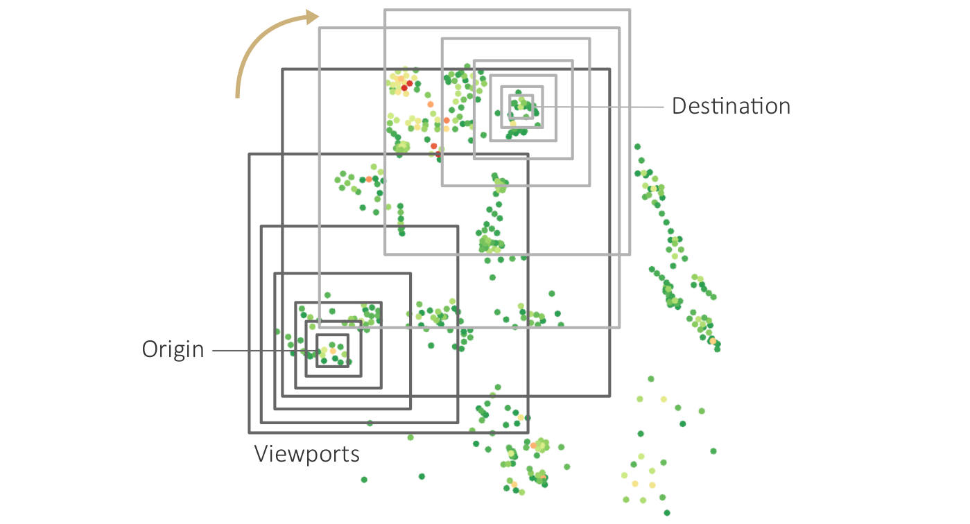
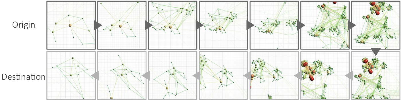
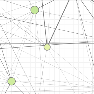
Navigation recommendations for graph visualization.
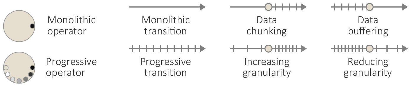
Visualization of progressively processed data chunks of car crashes from a database with more than 370,000 entries. (b) Prioritized progression of chunks.
Figure
Original book figure.
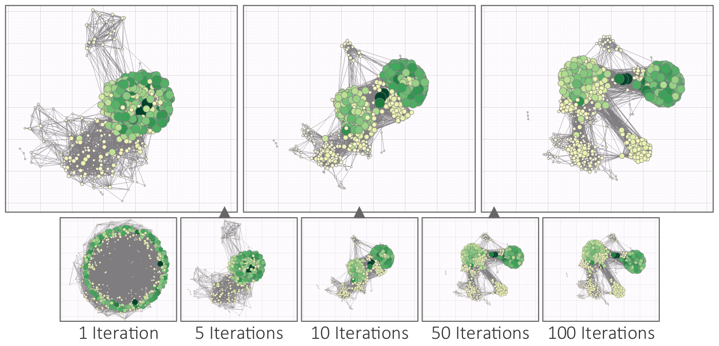
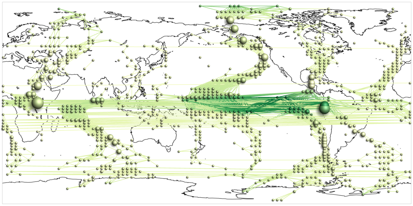
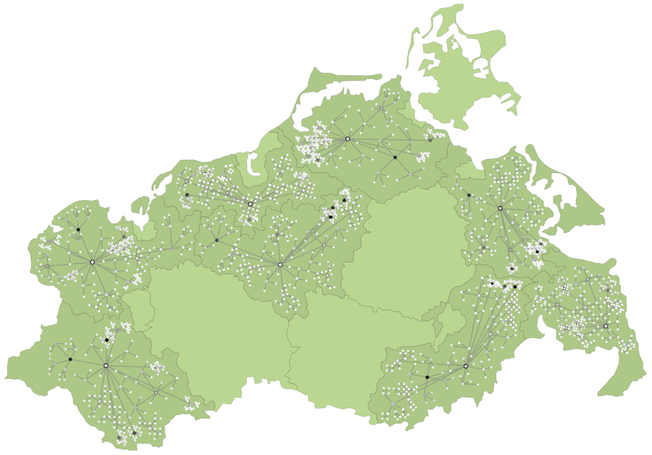
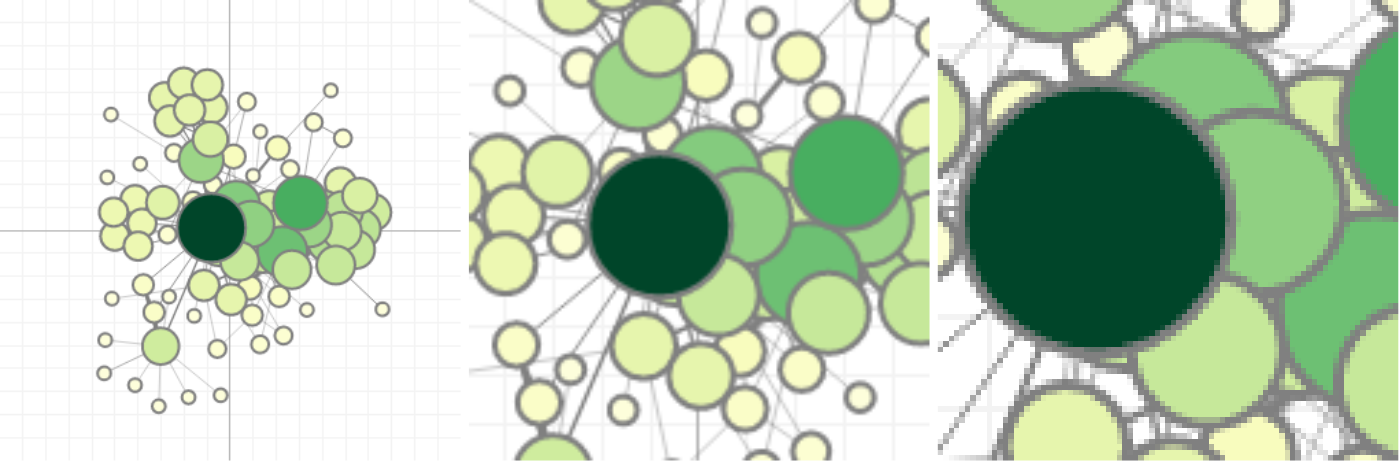
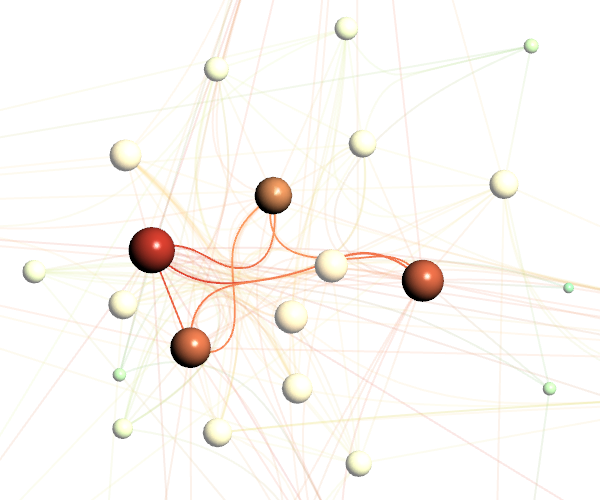
Progressive force-directed layout of a social network with 747 nodes and 60,050 edges.
Figure
Original book figure.
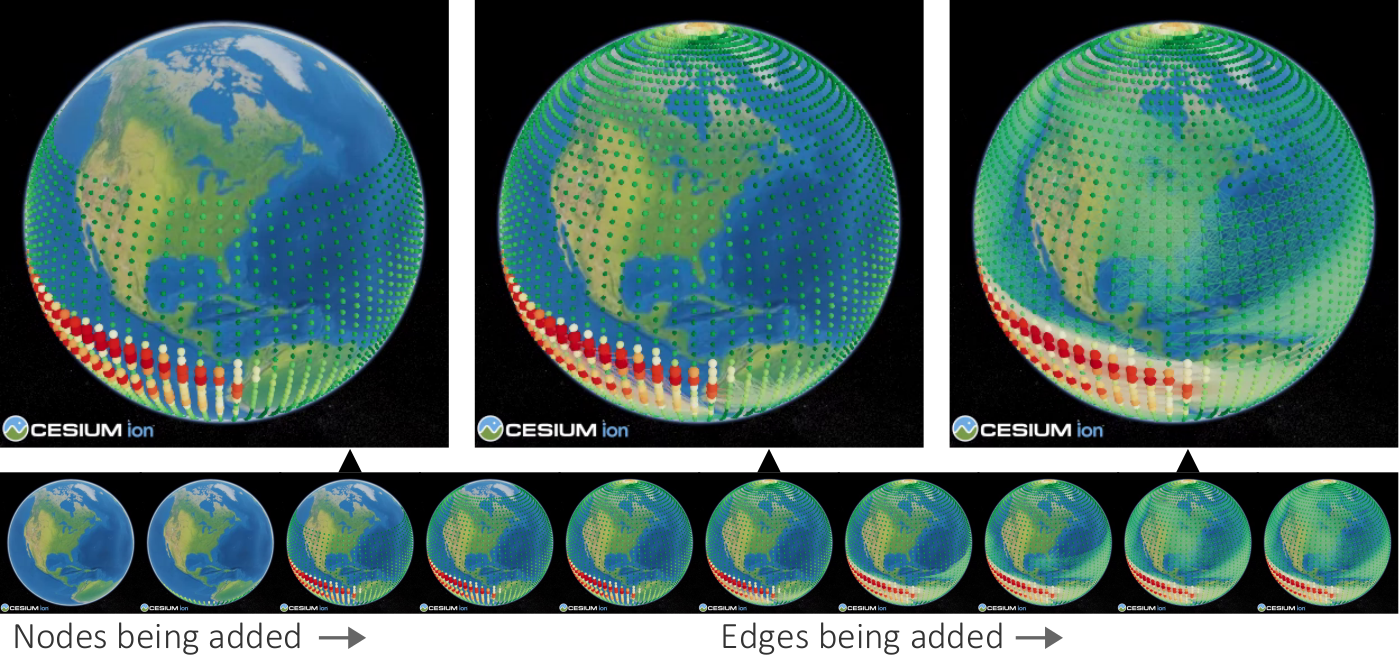
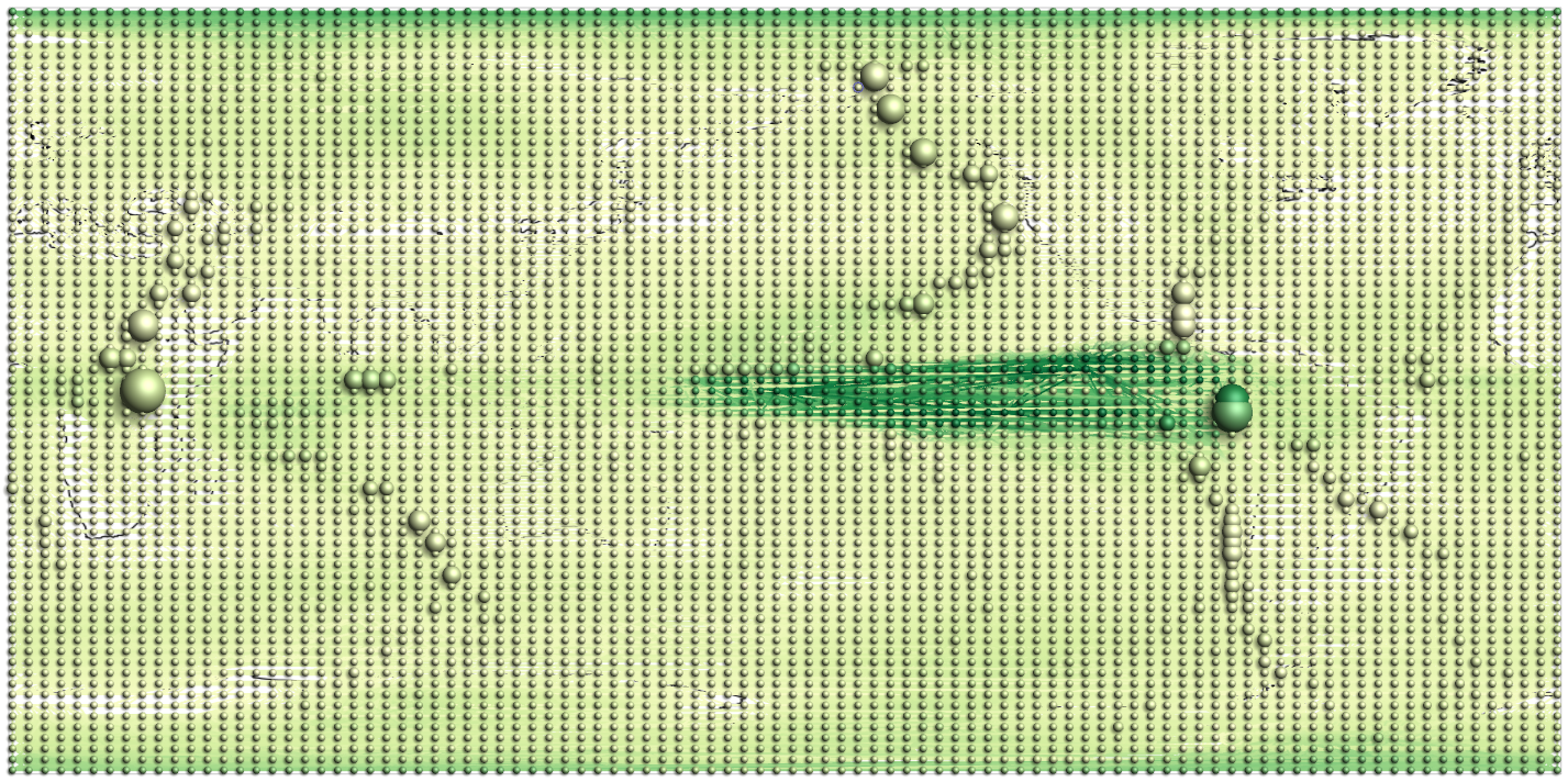
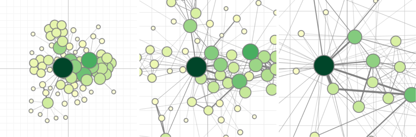
Progressive visualization of a climate network with about 6,816 nodes and 232,940 edges.


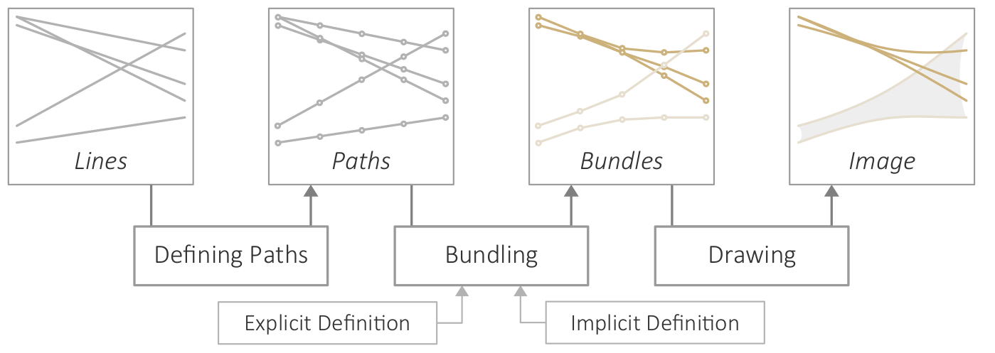


